Typography
Typography plays a key role in readability, accessibility, and overall presentation of information.
Inter: Google Font (Recommended)
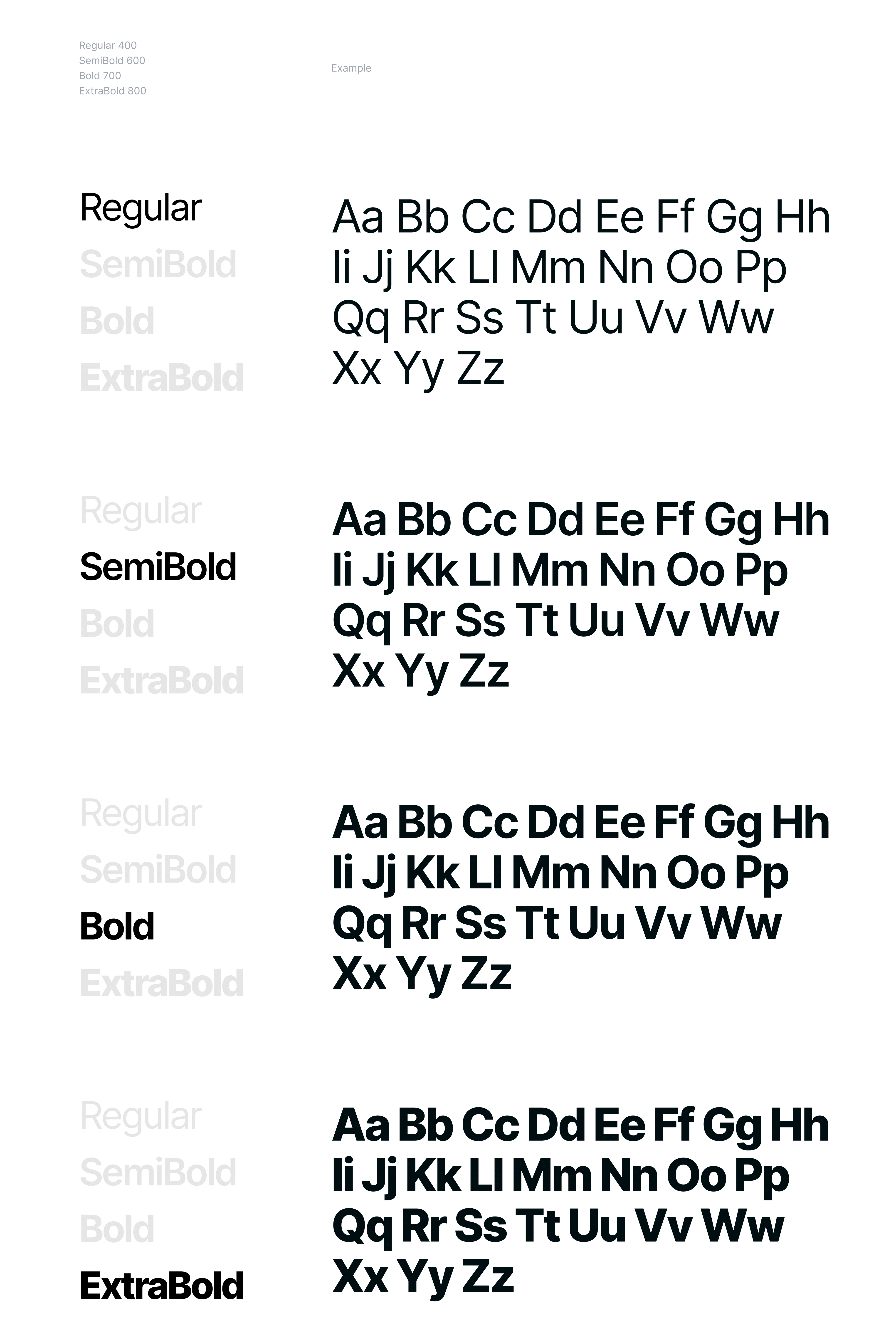
Inter is a modern, highly legible sans-serif font designed by Rasmus Andersson, optimized for digital interfaces. With tall x-heights and open letterforms, it ensures clarity at smaller sizes, enhancing readability across various devices and screen resolutions. This makes Inter ideal for user interfaces and web design where clear and accessible text is crucial.
Inter supports a wide range of languages, including Kinyarwanda, and offers multiple weights - Regular, Semi Bold, Bold, and Extra Bold - providing versatility for different text styles, from body copy to bold headlines. These distinct weights help establish a clear visual hierarchy, aiding in content comprehension and improving the overall user experience.
Readability
Inter is specifically crafted to maximize readability. Its clean and spacious letterforms reduce eye strain, making it easier for users to read lengthy texts and navigate through complex interfaces. The generous spacing and well-balanced proportions ensure that each character is easily distinguishable, which is essential for maintaining legibility in various contexts, such as mobile devices and high-resolution displays.
Accessibility
Designed with accessibility in mind, Inter enhances the usability of digital content for all users, including those with visual
impairments. The font’s clear distinctions between similar characters (like "1" and "l" or "0" and "O") minimize confusion and errors. Additionally, Inter's support for high contrast settings and scalable design ensures compatibility with screen readers and other assistive technologies, making digital content more inclusive and easier to navigate for everyone.
Versatility and Aesthetic
Its clean and minimalist design has made Inter a popular choice for creating a sleek, professional look across digital platforms. Whether used for body text, headings, or UI elements, Inter maintains a consistent and harmonious appearance that adapts seamlessly to various design needs.
In summary, Inter stands out as a font that not only offers aesthetic flexibility but also prioritizes readability and accessibility, ensuring that digital content is both visually appealing and easy to engage with for a diverse audience.
No Comments