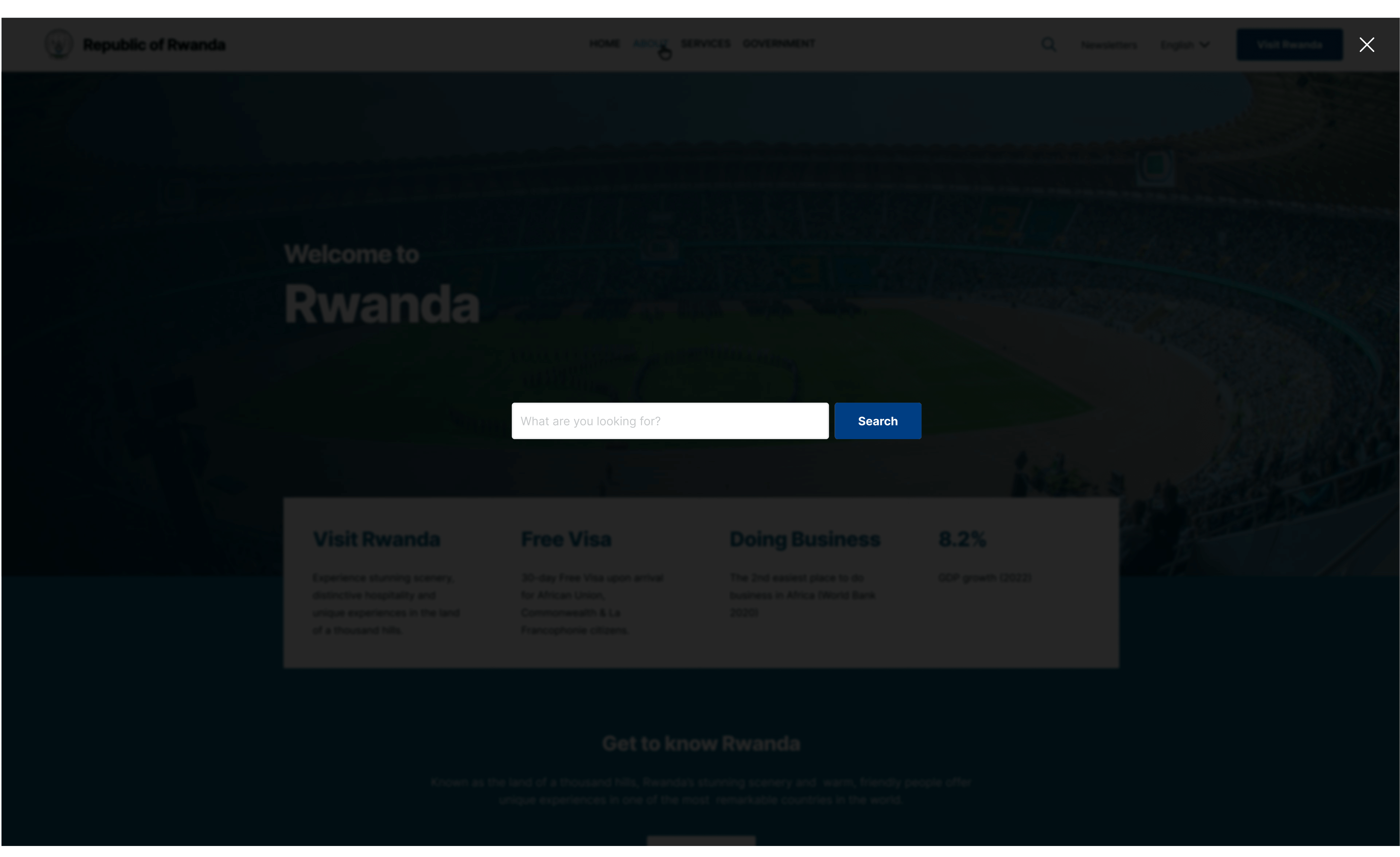
Search Functionality
Search trigger & form
Rules: Use a universally recognized search icon (magnifying glass) in the header and ensure icon is easily clickable/tappable and stands out from the other header elements

- Provide an accessible label using area-label to describe the icon (e.g “Open search”) and enable keyboard focus and activation for users who navigate via keyboard.
- Icon should remain visible on all devices, if space is limited on smaller screens consider alternative placement that do not compromise accessibility.
- Clicking the search icon will open a full screen modal with a close button and the search input text and submit.
Results Page
Rules: Display the user’s search query so they know what was searched
- Present results in a clean and organized list with clear headings with link, short description and any relevant metadata like dates or categories.
- Limit the number of results and provide pagination if there are multiple results.
- Clearly indicate if there are no results found, and offer alternative search option.
- Maintain visual consistency with the rest of the site’s design, ensuring that typography, spacings and colors follow the proposed design.
- Use proper hover and focus states for the links.
No Comments