Branding Elements
Establish clear rules for logo usage, color palette, and cultural patterns that maintain brand integrity and enhance visual coherence.
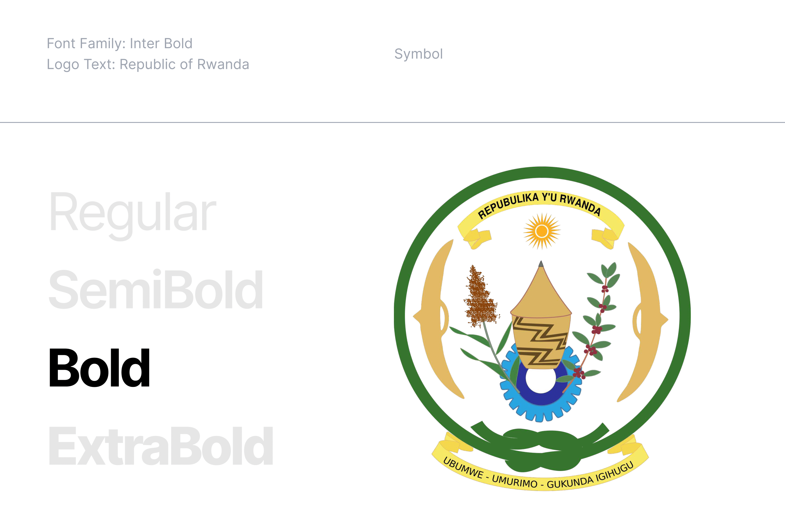
Logo
Text & Symbol
Spacings, Proportions & Safety Areas
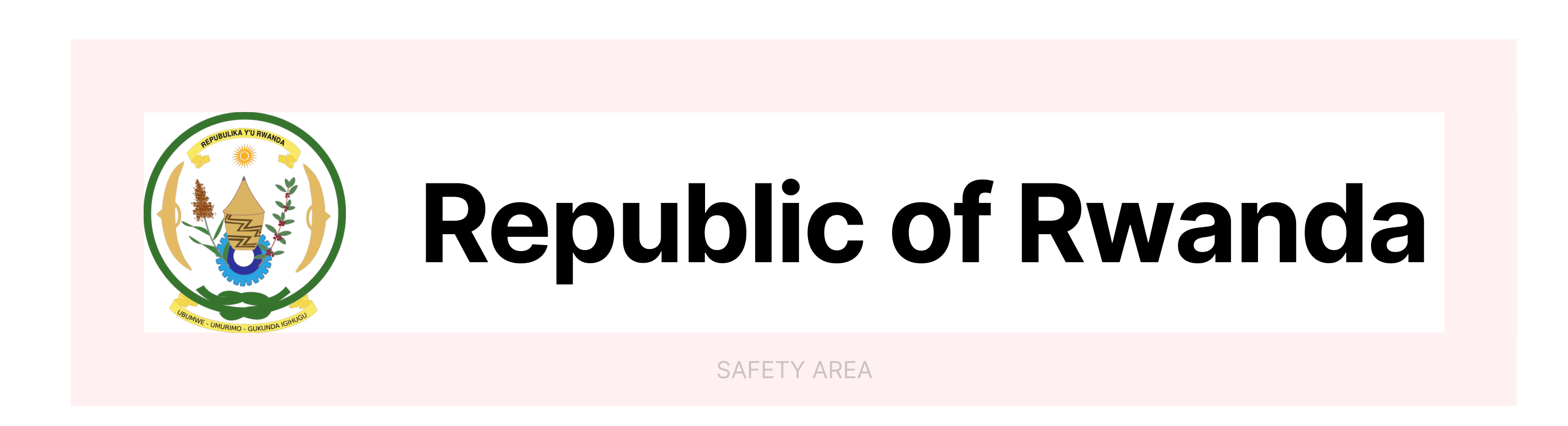
Symbol and Text Spacing: 1/3 Symbol Height
Text size: 1/2 Symbol Height, vertically aligned middle
Letter Spacing: -2%
Safety Area: 1/3 Symbol Height around the Logo
Symbol and Text Spacing: The space between the symbol and the text should be set at 1/3 of the symbol's height.
Text Size: The text should have a height that is 1/2 of the symbol's height and should be vertically aligned to the middle of the symbol.
Letter Spacing: Adjust the letter spacing to -2% for optimal visual balance and legibility.
Safety Area: A clear space around the logo should be maintained, equivalent to 1/3 of the symbol's height. This area ensures that no other elements interfere with the visual integrity of the logo.
These proportions and guidelines ensure that the logo remains balanced and visually consistent across all applications.
Brand
Color Names & Codes of the Rwanda Flag
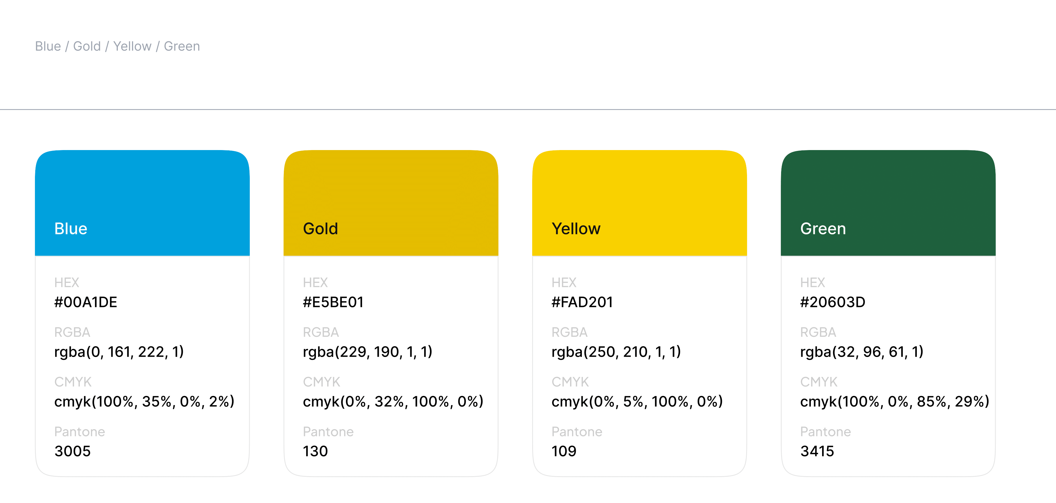
Branding colors are not directly utilized in the identity manual, the colors that are implemented are variations derived from those original hues.
Colors
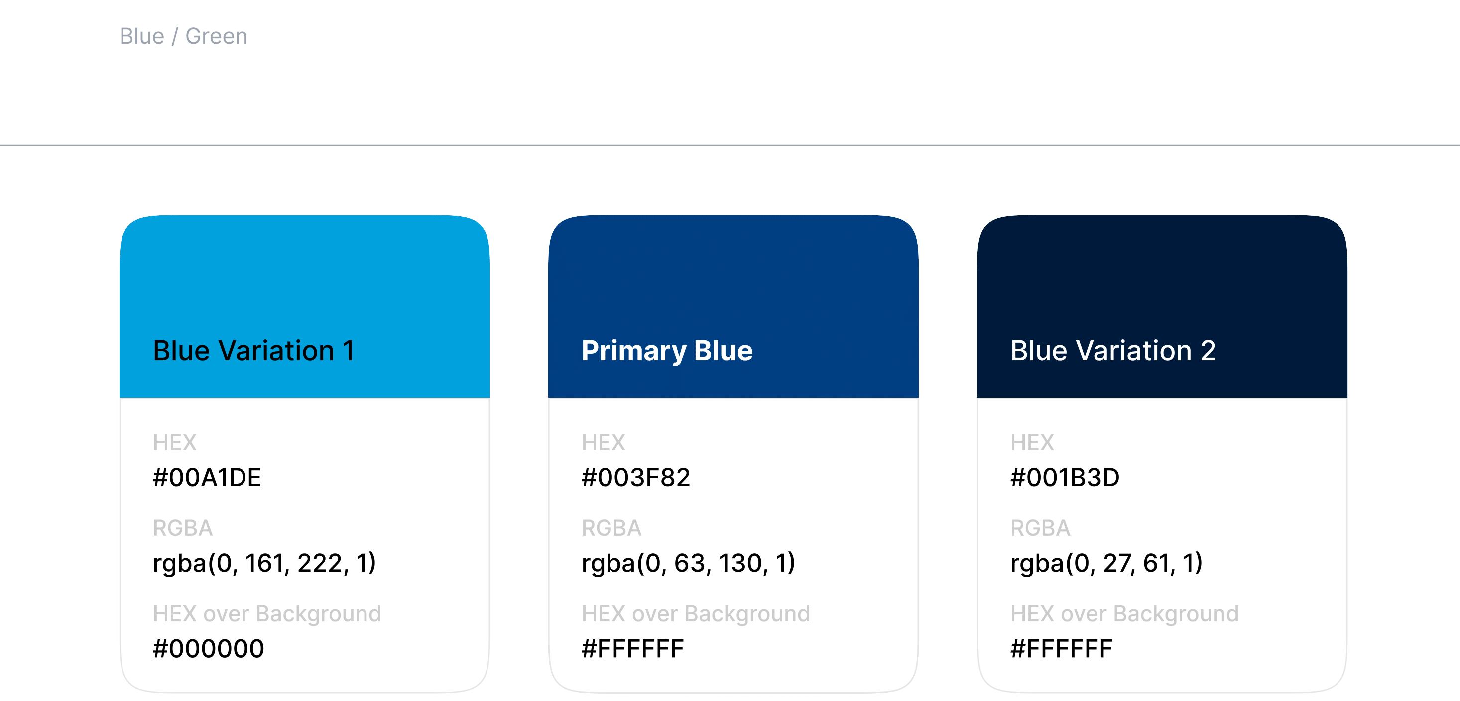
Primary with Variations
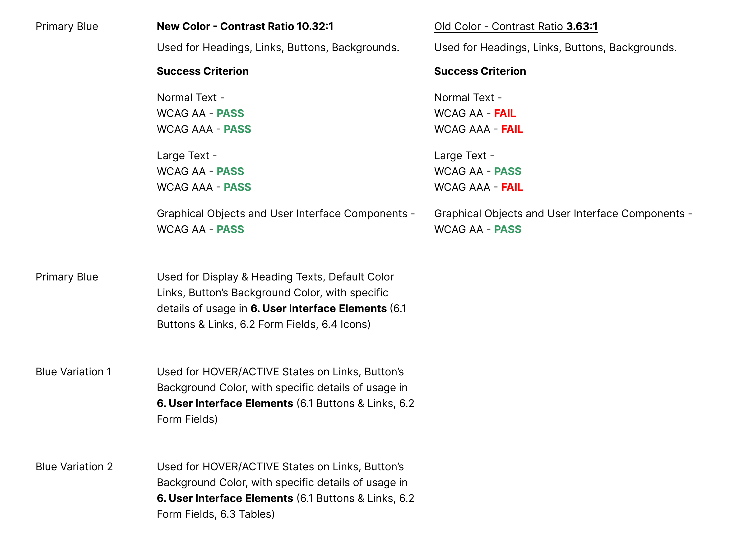
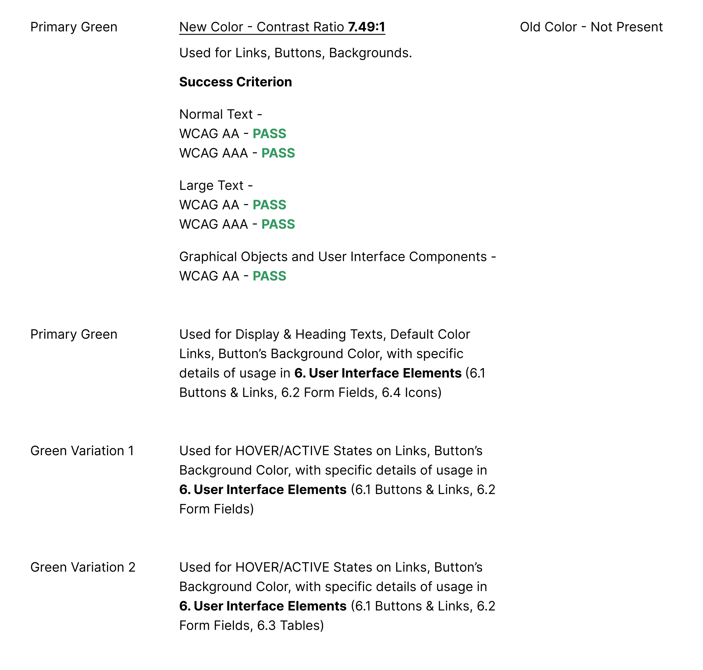
The intent of this Success Criterion is to provide enough contrast between text and its background, so that it can be read by people with moderately low vision or impaired contrast perception, without the use of contrast-enhancing assistive technology.
The Primary Blue and its variations will be used in the Main Government Website.
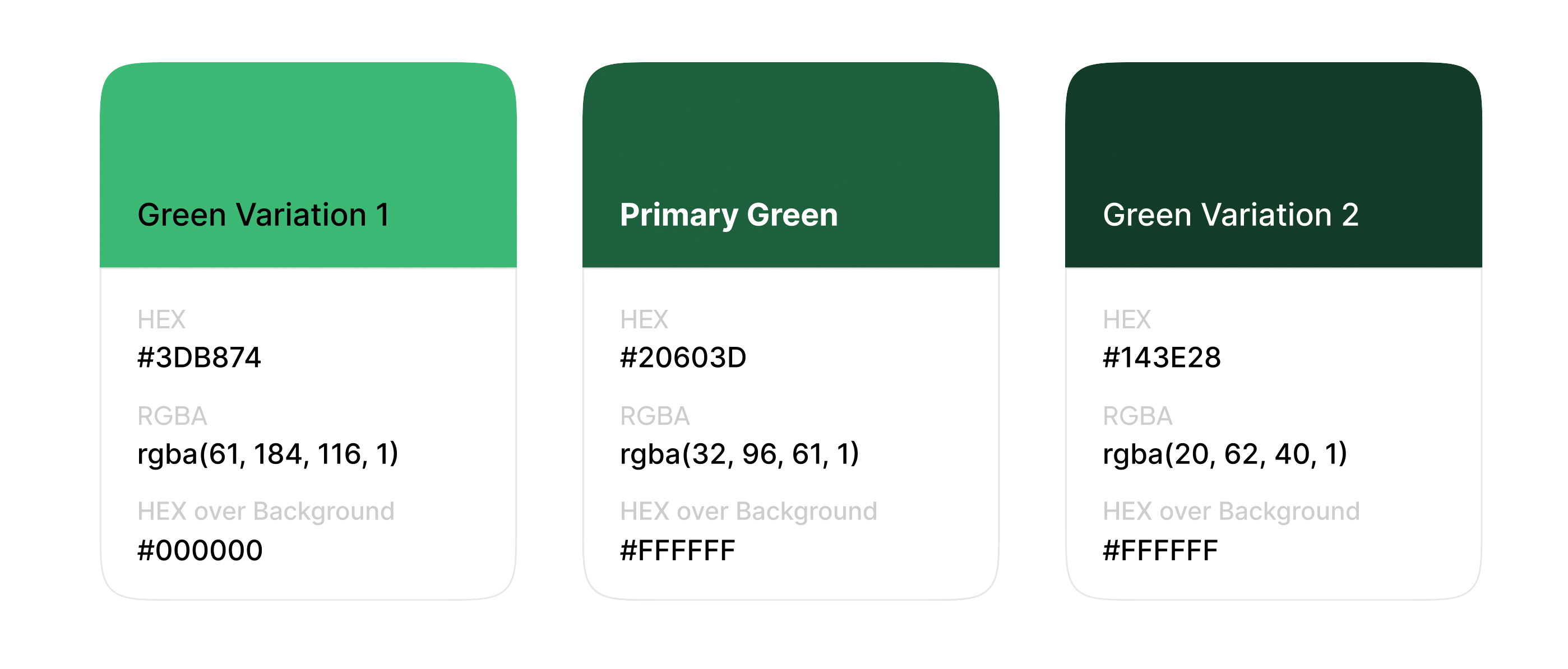
The Primary Green and its variations can be used in other categories of Government Websites, such as Institutions, which can be defined later.
Secondary with Variations
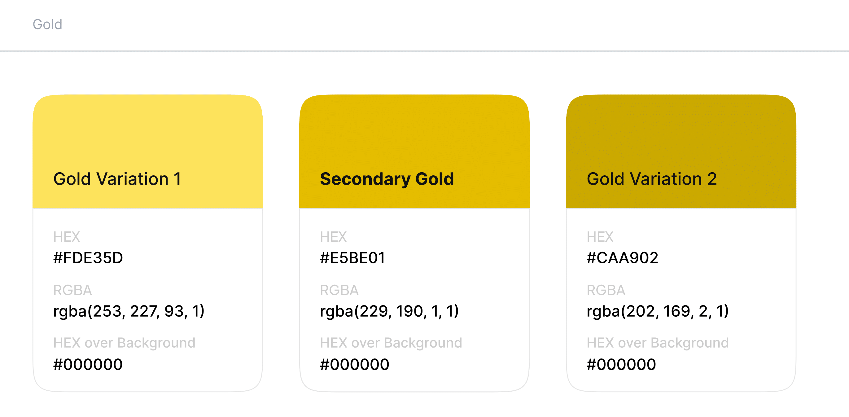
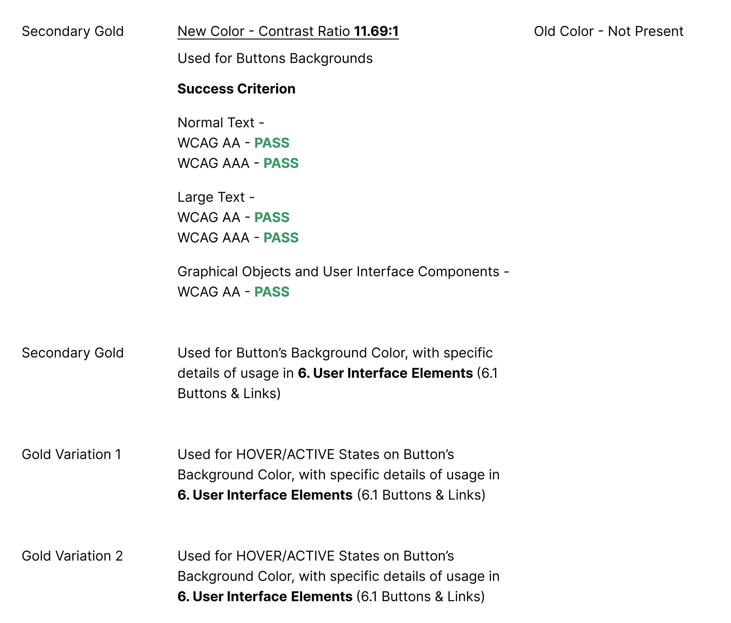
The Secondary Gold and its variations can be used in a different category of Government Websites, such as National Bank or other which can be defined later.
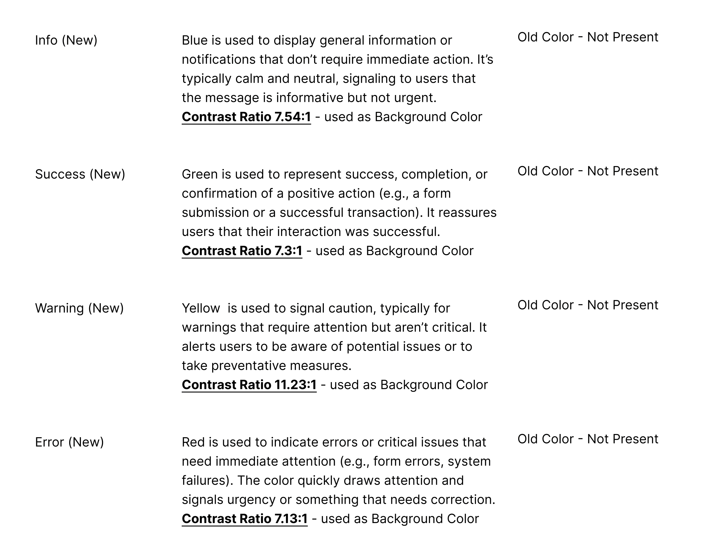
State & Achromatic
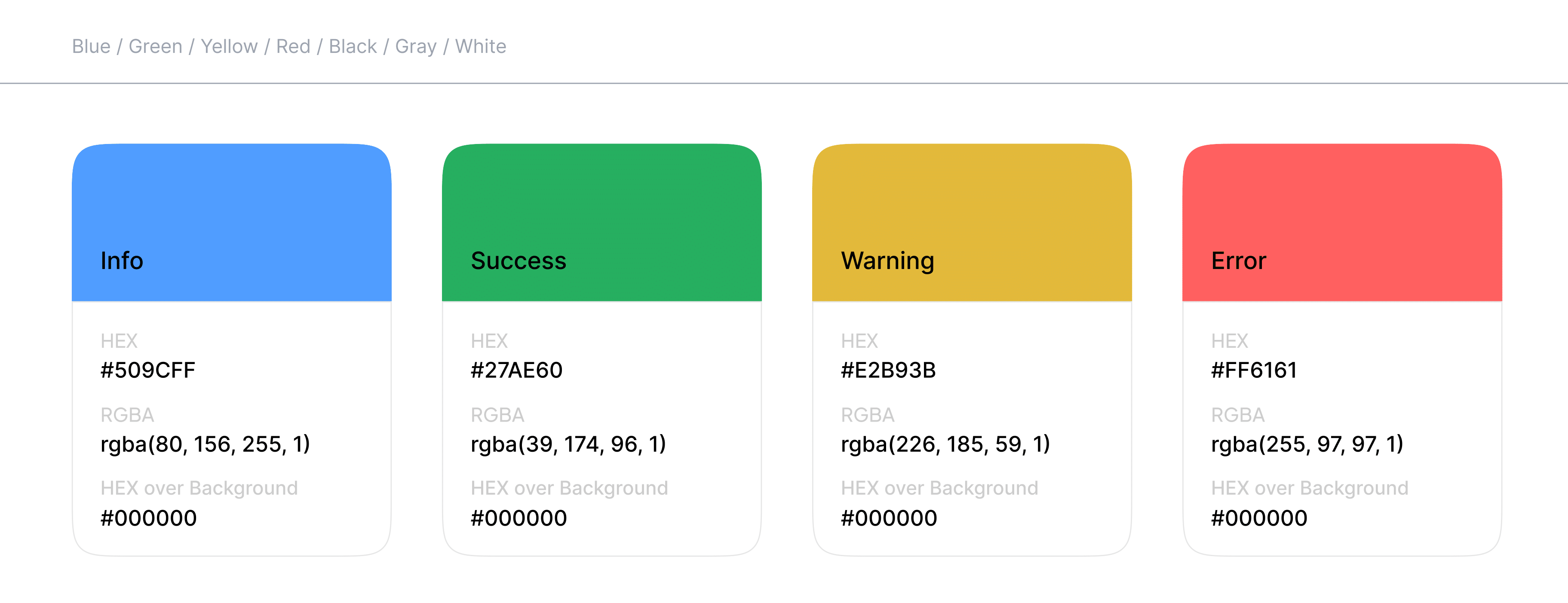
State colors enhance user experience by providing intuitive feedback, making it easier for users to understand the status of their interactions at a glance. They help guide users through processes while also ensuring clarity and prompt action where
necessary.
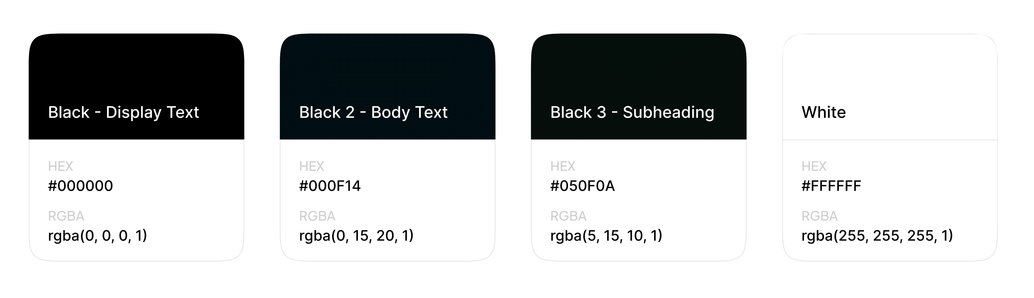
Black -Display Text
Used for Display & Heading Texts, with specific details of usage in Typography (Display 1, Display 2, Heading 1, Heading 2, Heading 3, Heading 4, Heading 5, Heading 6)
Black 2 - Body Text
Used for Paragraphs and Captions, with specific details of usage in Typography (Paragraph 1, Paragraph 2, Paragraph 3, Caption)
Black 3 - Subheading
Used for Subheadings, with specific details of usage in Typography (Subheading) White
White
Used as inverted color for all the Black colors defined, e.g Hero Intro Text with background-image, Gradient or Solid Colored Background
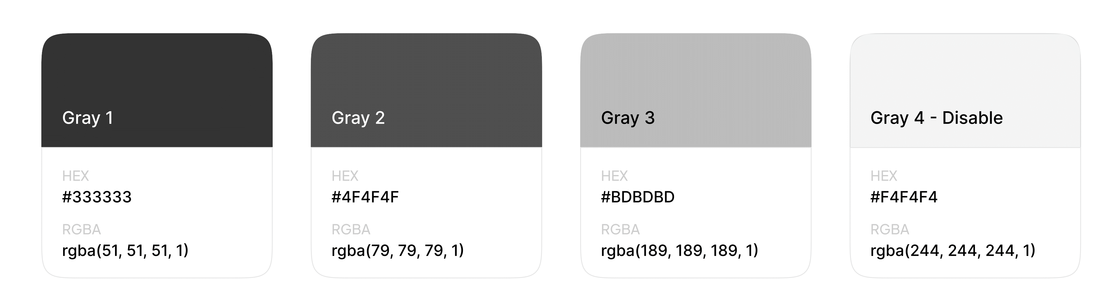
Gray Variants
Used for coloring various types of text formats, such as labels, input borders, and icons, with specific
details of usage in User Interface Elements
Gradients
Primary with Variations
Blue/Green Variants
Used as background color with no opacity on various types of web elements, such as Hero Intro, Footer, etc., or as image overlays with opacity on elements with an image background.
Patterns
Various
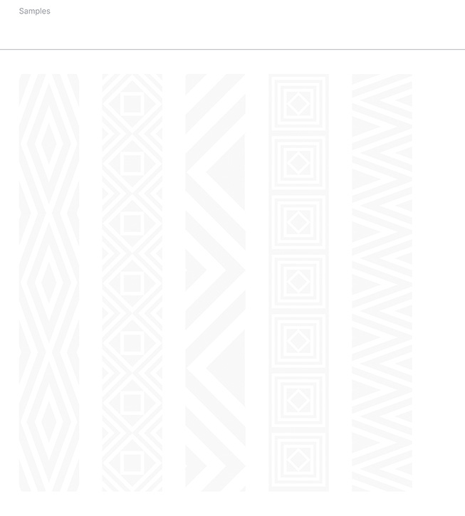
Pattern Variants
Should be used as subtle background textures or decorative borders, can be applied to sections such as Footer, banners, or dividers, but should not overpower the content.
No Comments