Navigation Design
Main Menu
Purpose: Serves as the primary navigation for the site, guiding users to the most important sections of the website
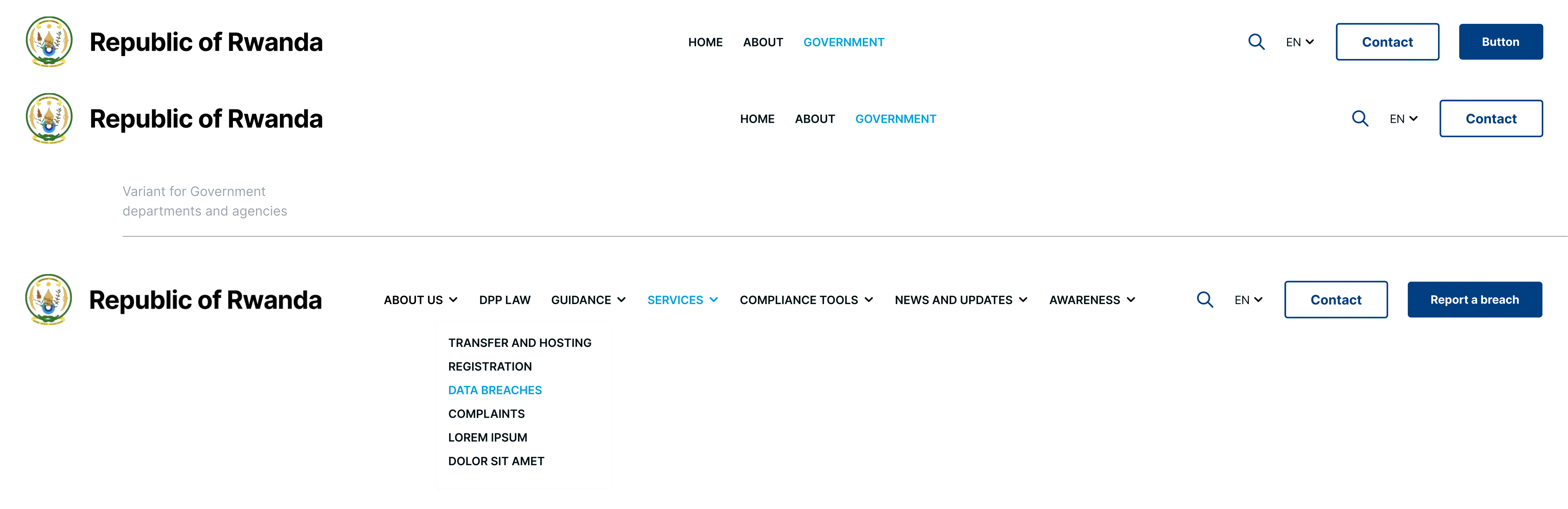
- Use clear, descriptive labels for each level menu item, avoid jargon to ensure language is understandable by any user.
- Limit the number of top level items to prevent visual clutter.
- Use drop-down for subcategories.
- On mobile devices a hamburger or toggle menu should be used.
- All menu items should have hover, focus and active states.
Secondary Navbar
Purpose: Secondary navigation should provide contextual or secondary navigation used on subpages.
Accepted Variant
Font-weight: Bold
Text: Uppercase
Font size: 16px
Line height: 32px
Letter spacing: 0

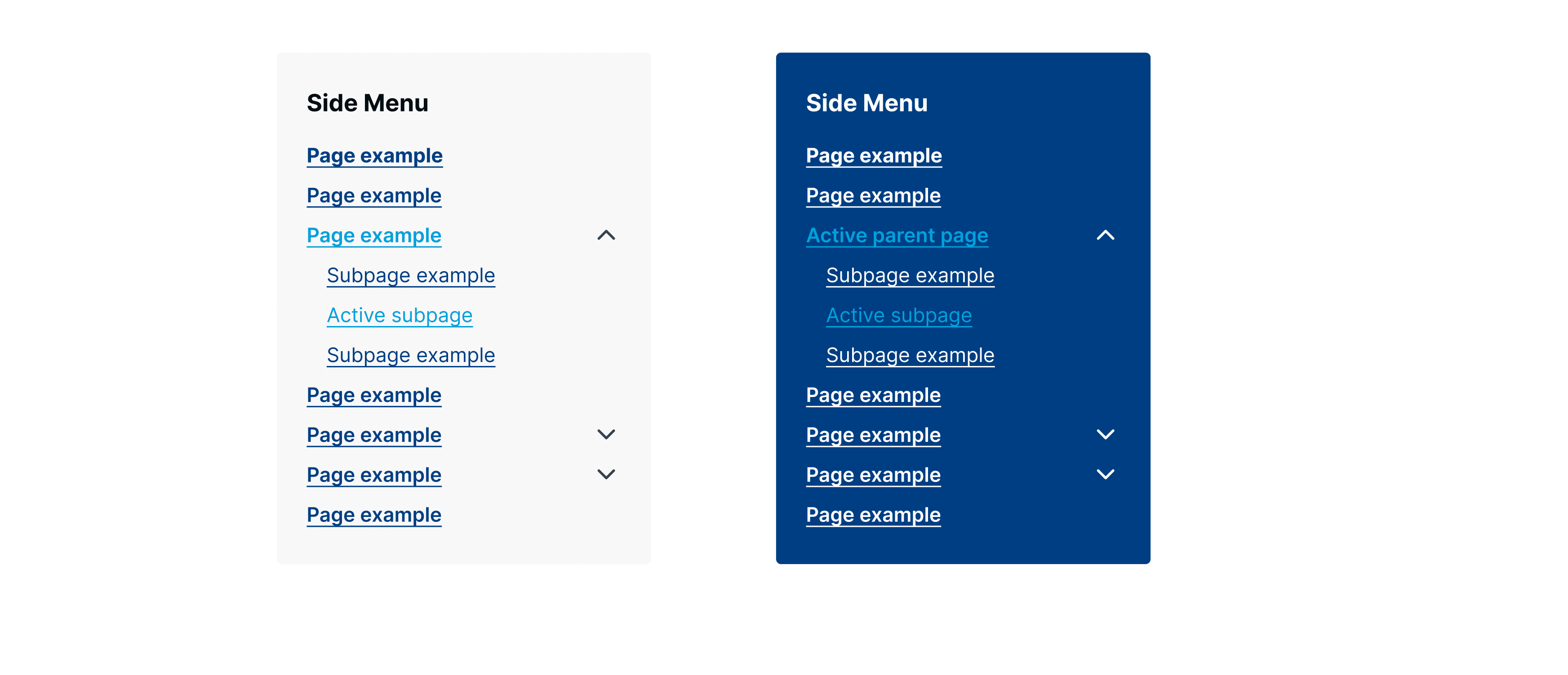
Side Menu
Footer Menu
Purpose: Contains secondary links that are important for legal, informational and support purposes

Breadcrumbs
Font size: 14px
Line height: 32px
Letter spacing:0

No Comments