**Preferred Version**: Government websites are required to use the latest stable Long-Term Support (LTS) release of TYPO3, currently **version 13 LTS,** to ensure long-term support, security, and compatibility with modern web technologies. Institutions are encouraged to upgrade promptly to the latest stable release as soon as it becomes available.
**Why TYPO3?** **Security and Compliance** TYPO3 provides advanced security features, including user access controls, secure workflows, and compliance with data protection standards essential for government institutions handling sensitive information. **Scalability and Performance** TYPO3 can handle large, high-traffic websites and complex content structures, ensuring consistent performance as government portals grow. **Multilingual Support** TYPO3 provides powerful built-in tools for managing content in multiple languages. It supports over 85 languages and offers flexible configuration for locales, reading directions, and fallback behavior. This ensures a consistent, accessible, and professional multilingual web presence. **Consistency and Standardization** Using TYPO3 ensures that all government websites follow a unified structure and design approach, simplifying maintenance and updates across institutions. **Local Capacity and Open Source** TYPO3 is open-source, which reduces licensing costs and allows customization to meet government needs. Local developers are trained in TYPO3, supporting local expertise and sustainability. For more information on TYPO3 and its features, visit the official TYPO3 website: [https://typo3.org/](https://typo3.org/) # Branding Elements Establish clear rules for logo usage, color palette, and cultural patterns that maintain brand integrity and enhance visual coherence. #### Logo **Text & Symbol** [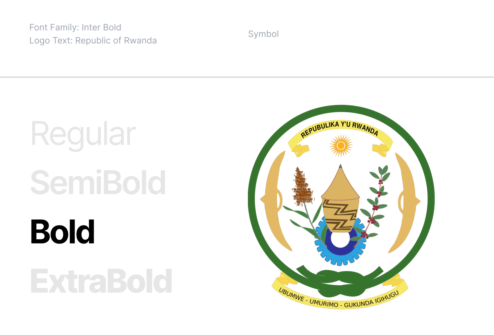](https://guidelines.risa.gov.rw/uploads/images/gallery/2025-10/logo1.png) **Spacings, Proportions & Safety Areas** Symbol and Text Spacing: 1/3 Symbol Height Text size: 1/2 Symbol Height, vertically aligned middle Letter Spacing: -2% Safety Area: 1/3 Symbol Height around the Logo [](https://guidelines.risa.gov.rw/uploads/images/gallery/2025-10/logo2.png) **Symbol and Text Spacing:** The space between the symbol and the text should be set at 1/3 of the symbol's height. **Text Size:** The text should have a height that is 1/2 of the symbol's height and should be vertically aligned to the middle of the symbol. **Letter Spacing:** Adjust the letter spacing to -2% for optimal visual balance and legibility. **Safety Area:** A clear space around the logo should be maintained, equivalent to 1/3 of the symbol's height. This area ensures that no other elements interfere with the visual integrity of the logo. These proportions and guidelines ensure that the logo remains balanced and visually consistent across all applications. #### Brand **Color Names & Codes of the Rwanda Flag** [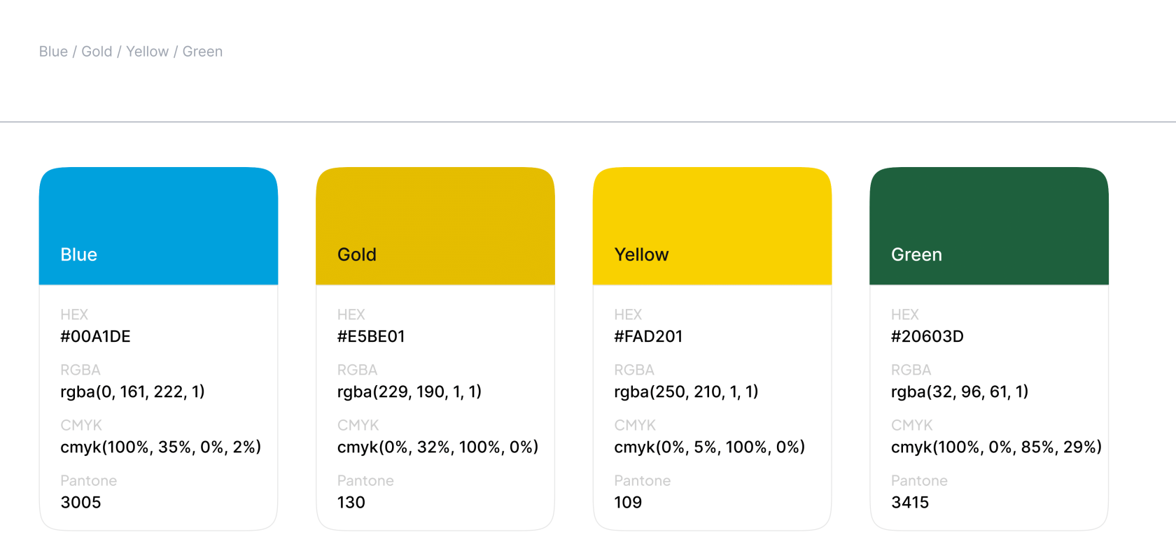](https://guidelines.risa.gov.rw/uploads/images/gallery/2025-10/brand1.png) Branding colors are not directly utilized in the identity manual, the colors that are implemented are variations derived from those original hues. #### Colors **Primary with Variations** [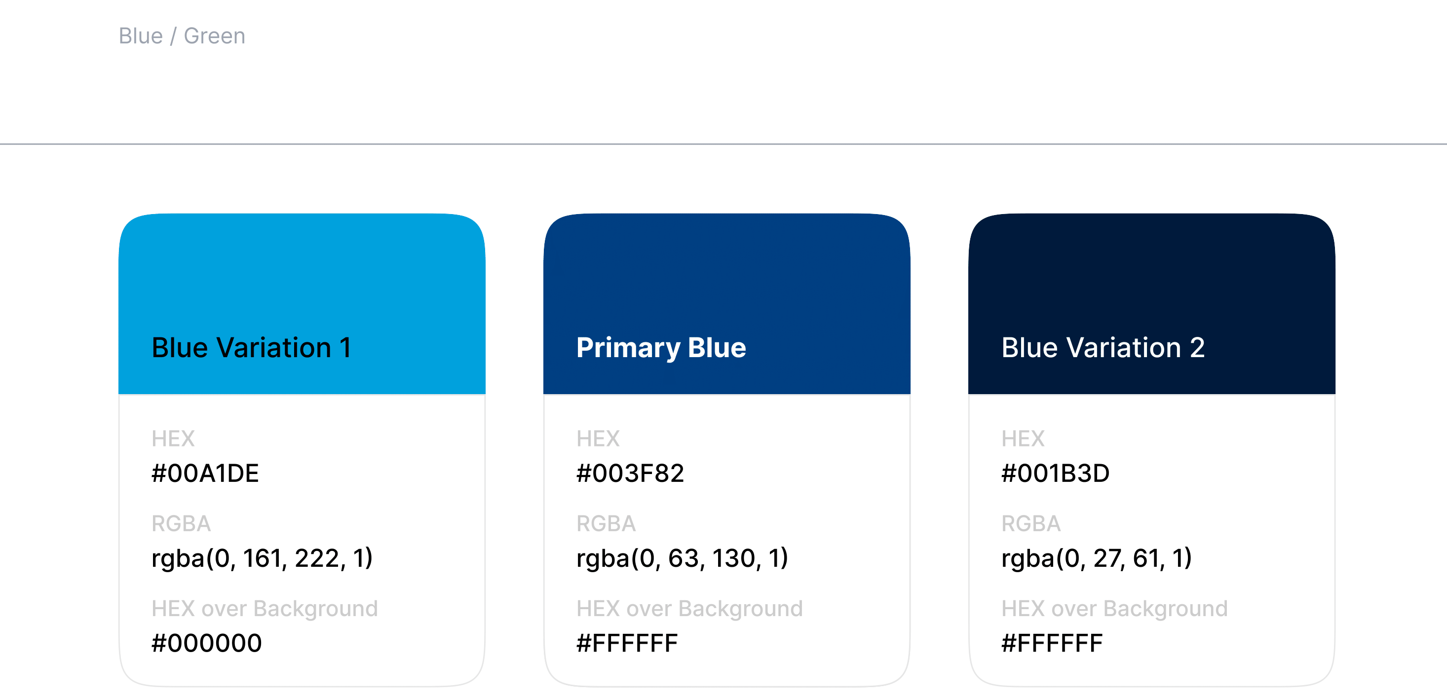](https://guidelines.risa.gov.rw/uploads/images/gallery/2025-10/color1.png) The intent of this **Success Criterion** is to provide enough contrast between text and its background, so that it can be read by people with moderately low vision or impaired contrast perception, without the use of contrast-enhancing assistive technology. The Primary Blue and its variations will be used in the Main Government Website. [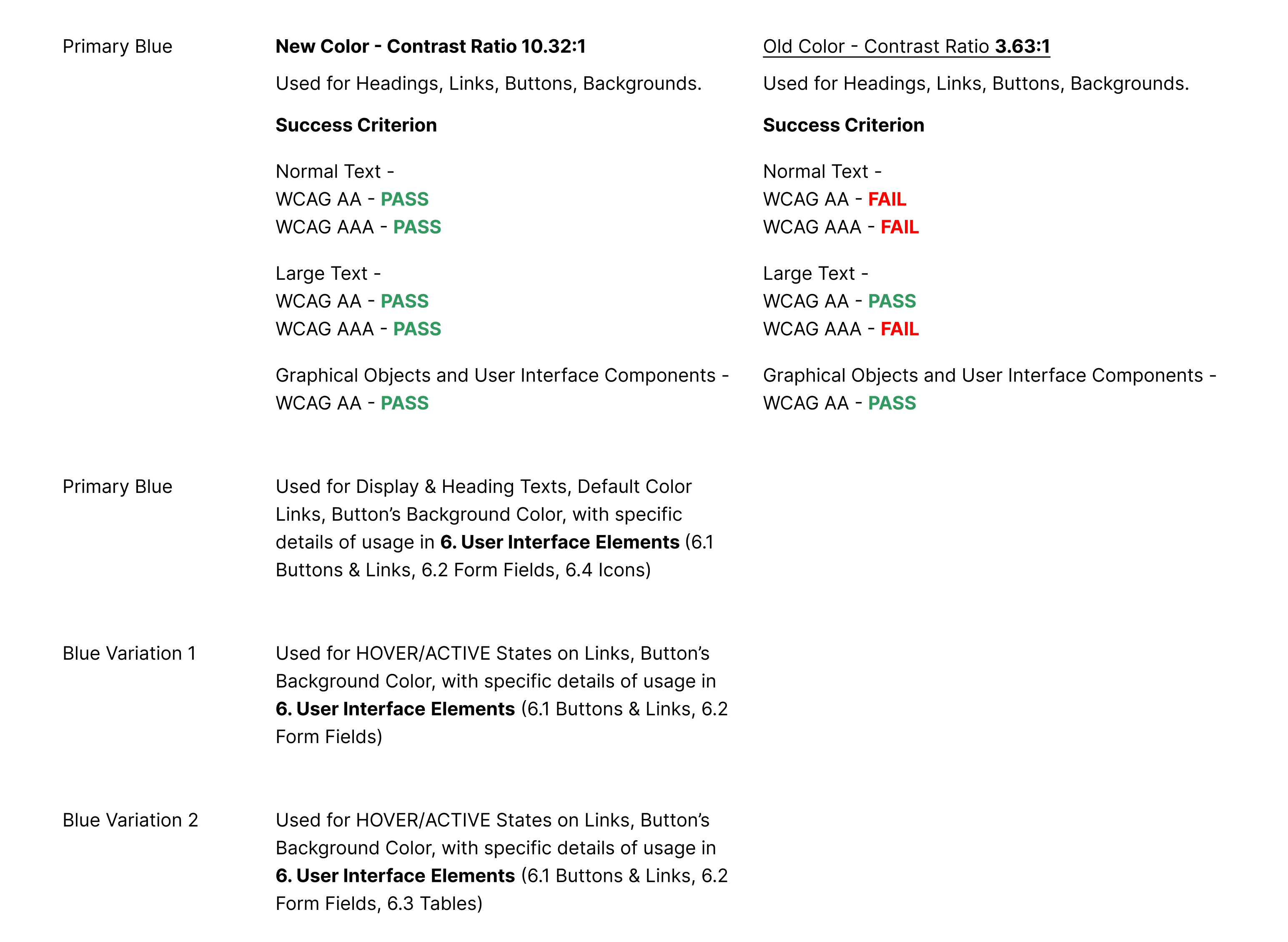](https://guidelines.risa.gov.rw/uploads/images/gallery/2025-10/color2.png) [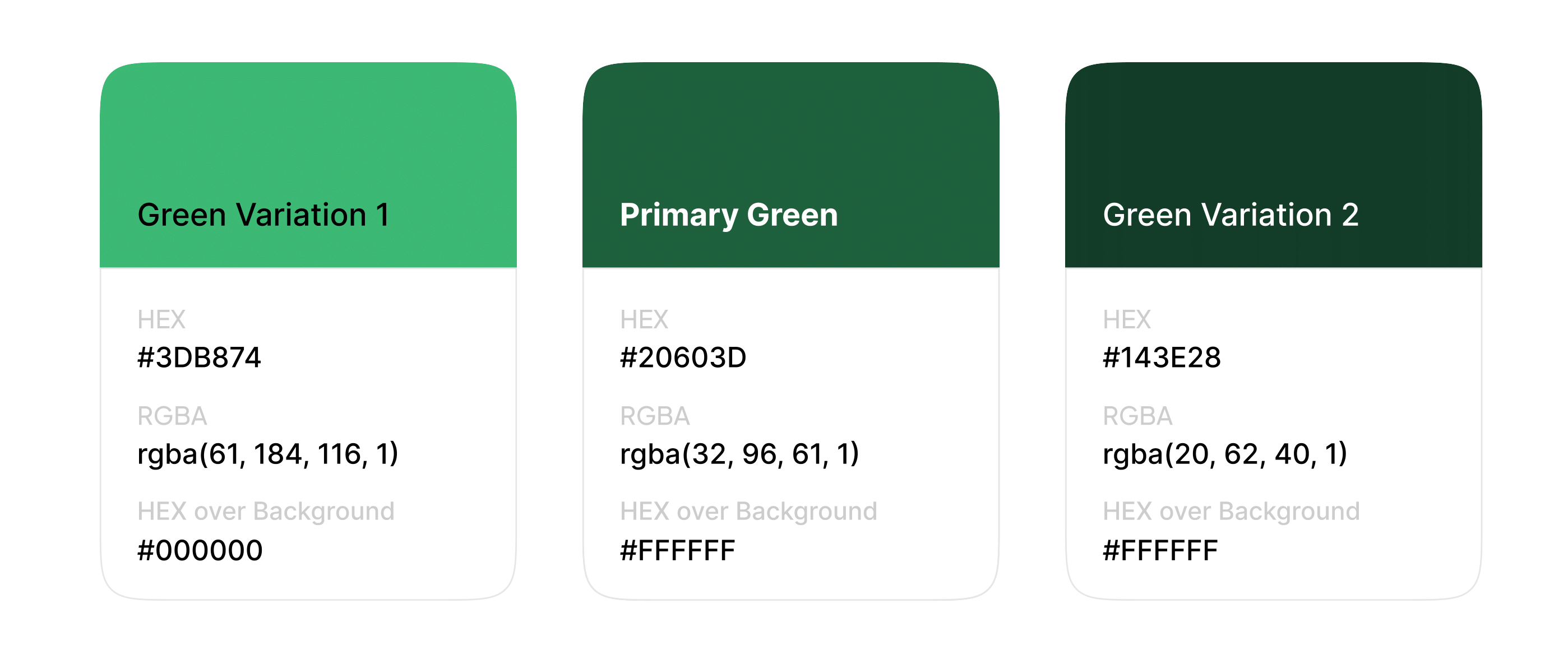](https://guidelines.risa.gov.rw/uploads/images/gallery/2025-10/color3.png) The Primary Green and its variations can be used in other categories of Government Websites, such as Institutions, which can be defined later. [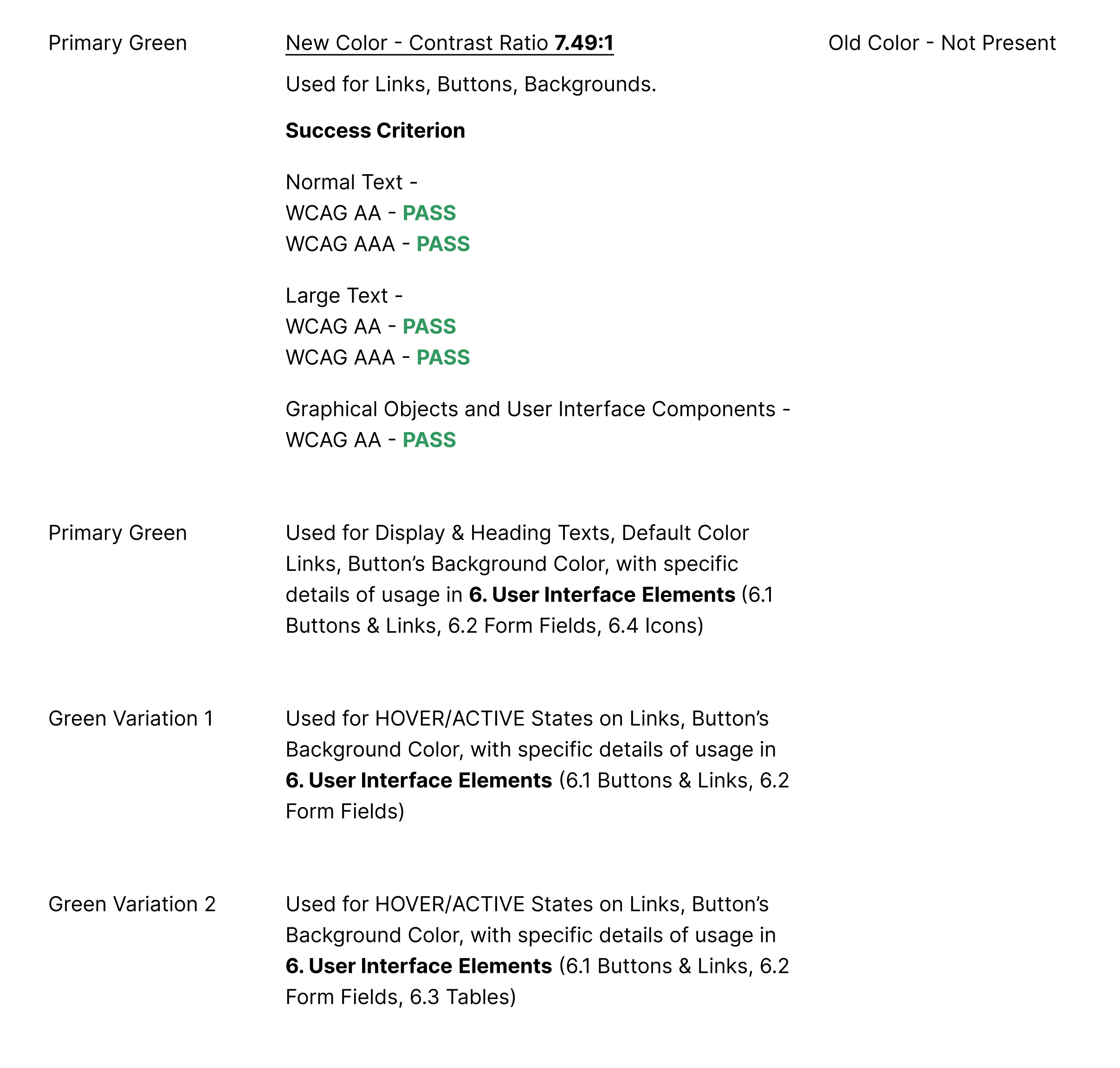](https://guidelines.risa.gov.rw/uploads/images/gallery/2025-10/color4.png) **Secondary with Variations** **[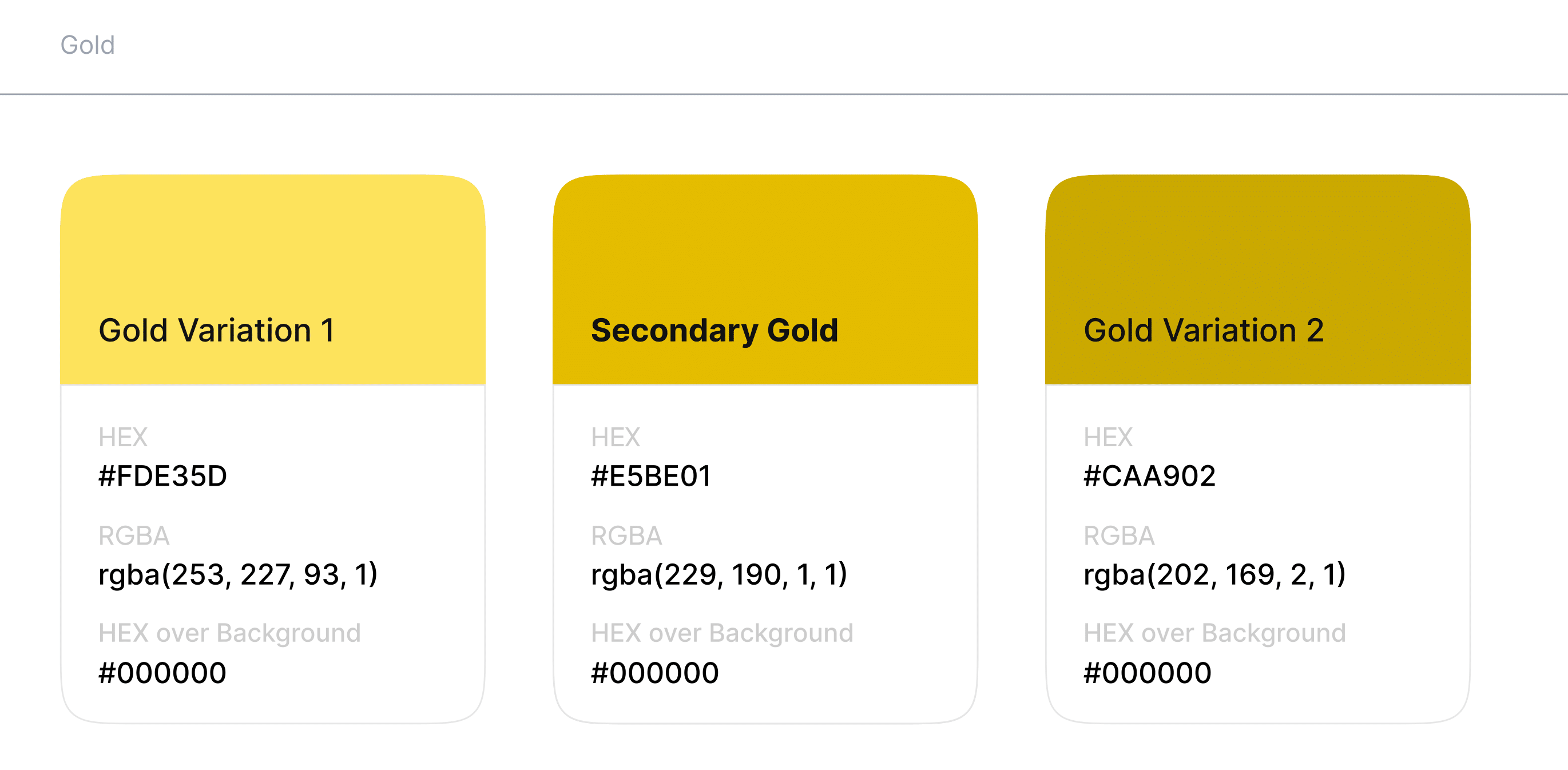](https://guidelines.risa.gov.rw/uploads/images/gallery/2025-10/color5.png)** The Secondary Gold and its variations can be used in a different category of Government Websites, such as National Bank or other which can be defined later. [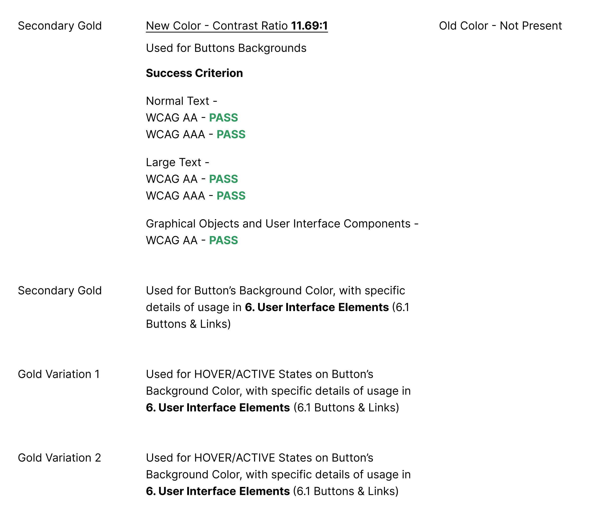](https://guidelines.risa.gov.rw/uploads/images/gallery/2025-10/color6.png) **State & Achromatic** **[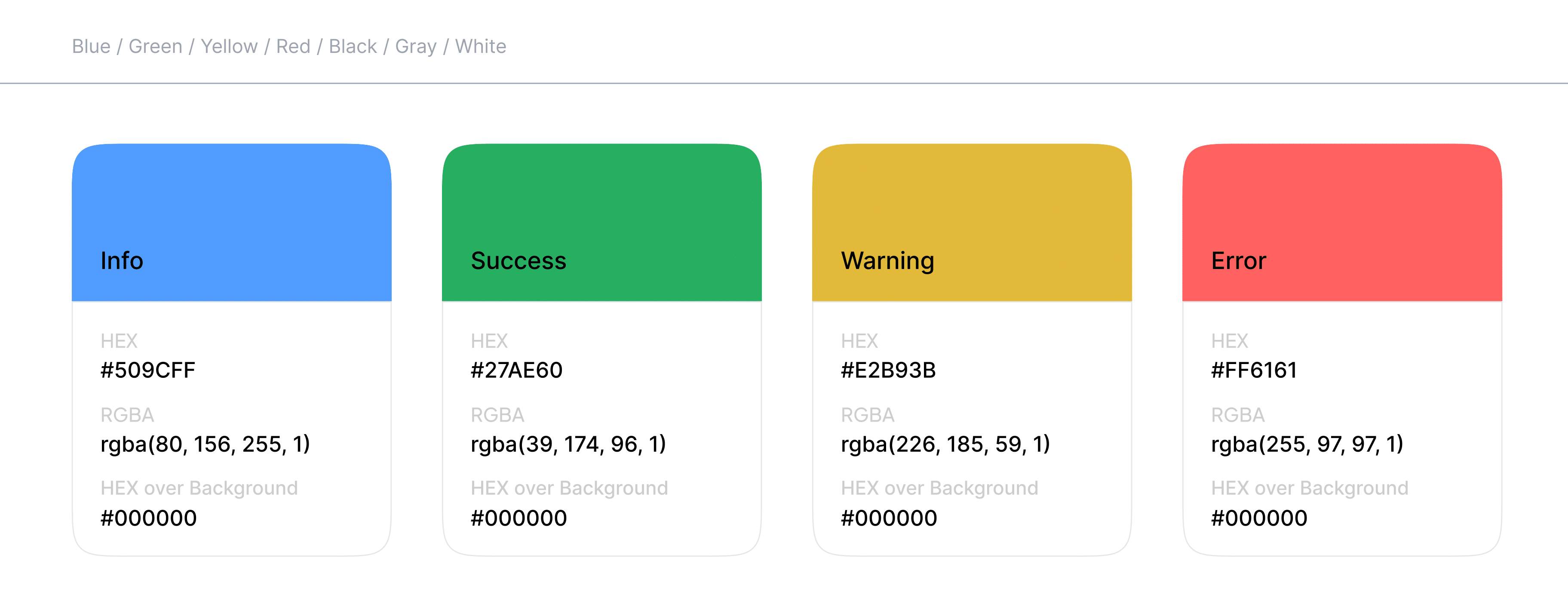](https://guidelines.risa.gov.rw/uploads/images/gallery/2025-10/color7.png)** State colors enhance user experience by providing intuitive feedback, making it easier for users to understand the status of their interactions at a glance. They help guide users through processes while also ensuring clarity and prompt action where necessary. [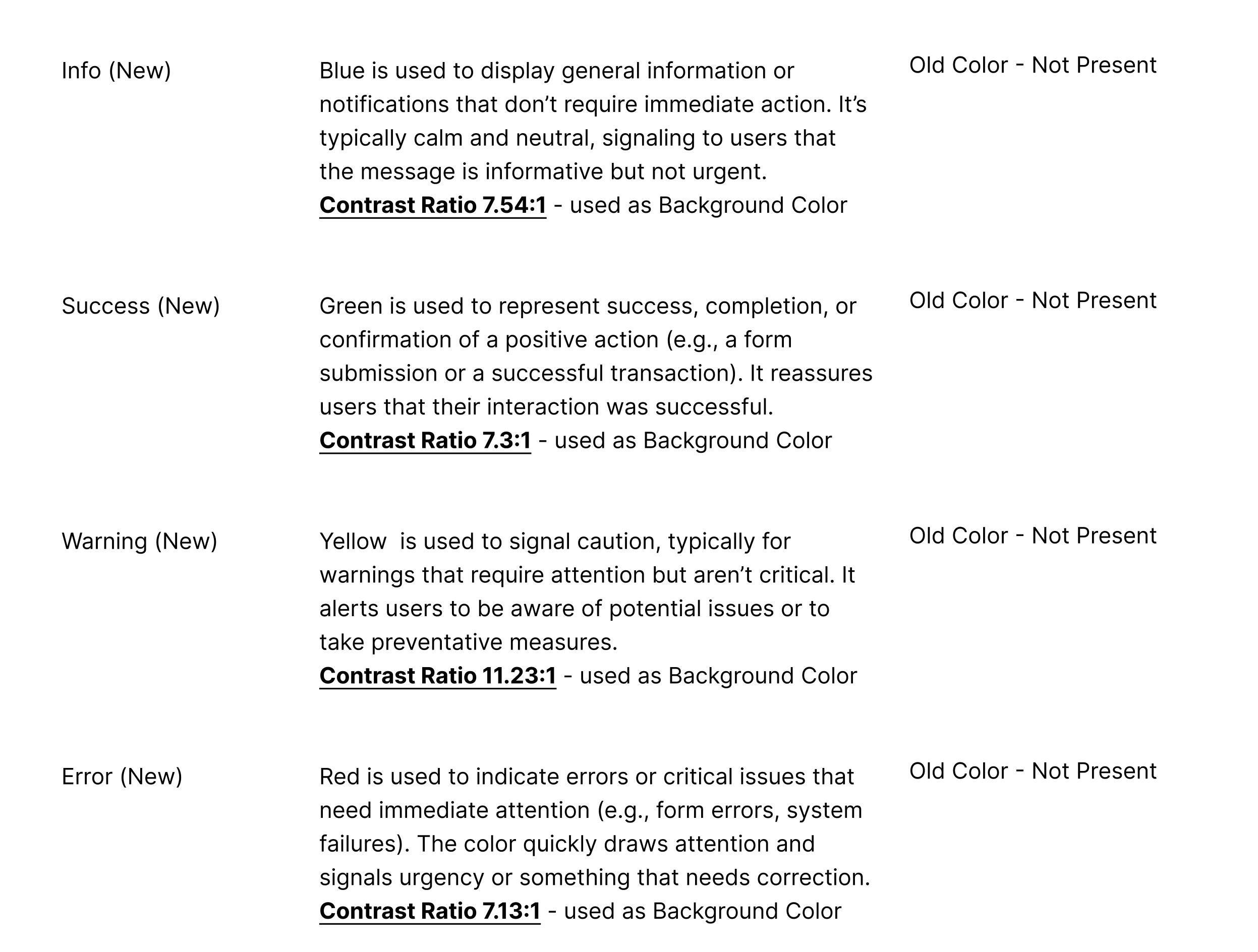](https://guidelines.risa.gov.rw/uploads/images/gallery/2025-10/color8.png) [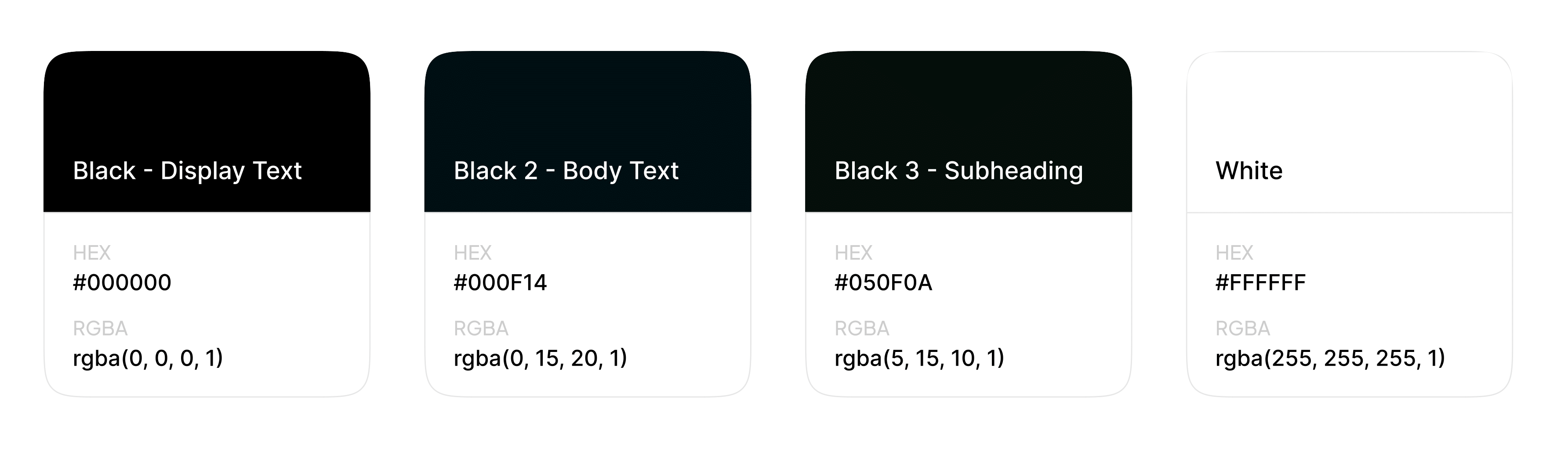](https://guidelines.risa.gov.rw/uploads/images/gallery/2025-10/color9.png) **Black -Display Text** Used for Display & Heading Texts, with specific details of usage in **Typography** (Display 1, Display 2, Heading 1, Heading 2, Heading 3, Heading 4, Heading 5, Heading 6) **Black 2 - Body Text** Used for Paragraphs and Captions, with specific details of usage in **Typography** (Paragraph 1, Paragraph 2, Paragraph 3, Caption) **Black 3 - Subheading** Used for Subheadings, with specific details of usage in **Typography** (Subheading) White **White** Used as inverted color for all the Black colors defined, e.g Hero Intro Text with background-image, Gradient or Solid Colored Background [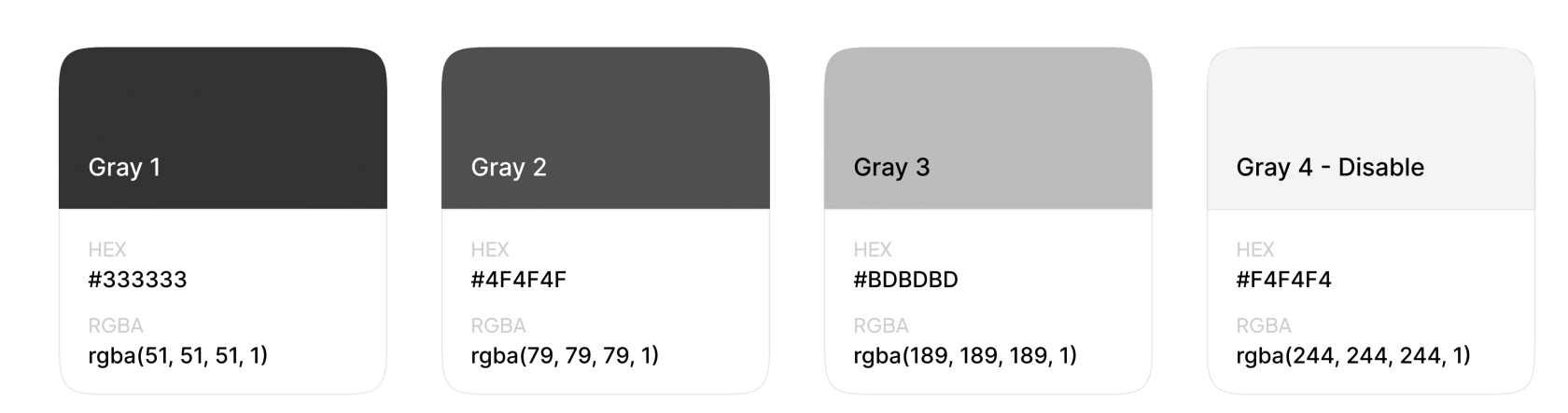](https://guidelines.risa.gov.rw/uploads/images/gallery/2025-10/color10.png) **Gray Variants** Used for coloring various types of text formats, such as labels, input borders, and icons, with specific details of usage in **User Interface Elements** #### Gradients **Primary with Variations**[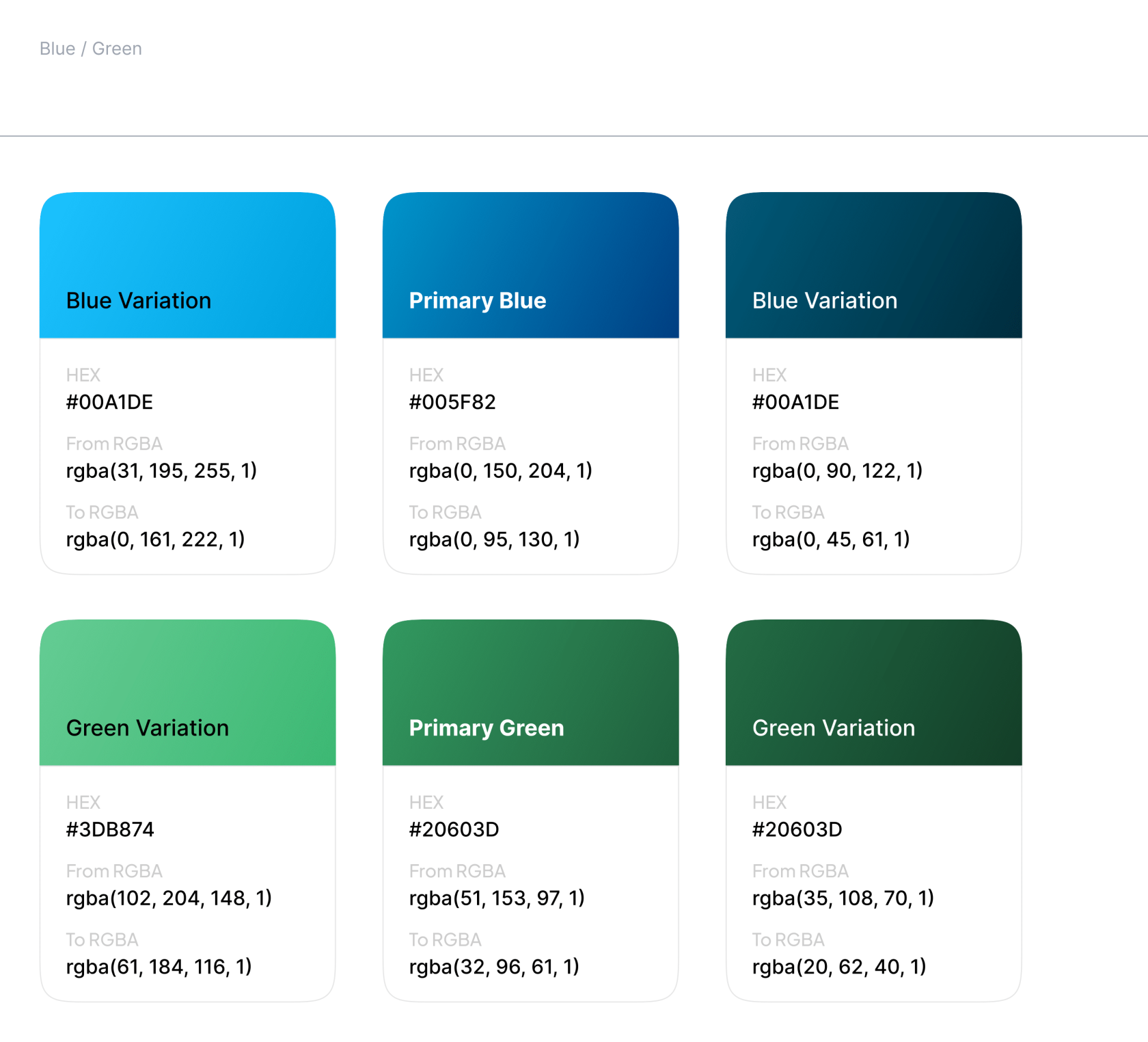](https://guidelines.risa.gov.rw/uploads/images/gallery/2025-10/color11.png) **Blue/Green Variants** Used as background color with no opacity on various types of web elements, such as Hero Intro, Footer, etc., or as image overlays with opacity on elements with an image background. #### Patterns **Various** [](https://guidelines.risa.gov.rw/uploads/images/gallery/2025-10/patterns.jpg) **Pattern Variants** Should be used as subtle background textures or decorative borders, can be applied to sections such as Footer, banners, or dividers, but should not overpower the content. **[Branding Elements Document ](https://guidelines.risa.gov.rw/attachments/82)** # Typography Typography plays a key role in readability, accessibility, and overall presentation of information. **Inter:** [Google Font](https://fonts.google.com/specimen/Inter "Inter ") **(Recommended) [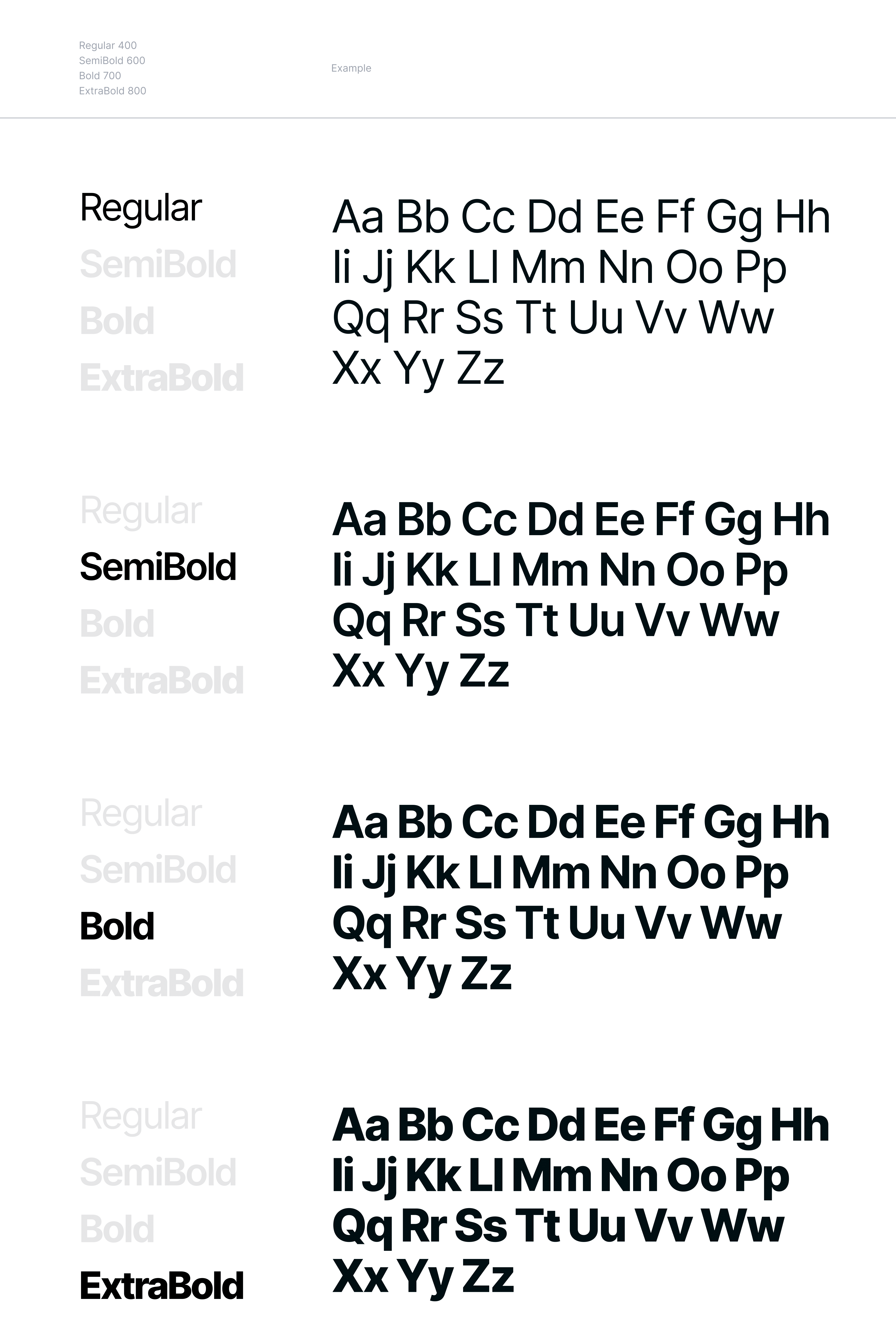](https://guidelines.risa.gov.rw/uploads/images/gallery/2025-10/inter.png) Inter is a modern, highly legible sans-serif font designed by Rasmus Andersson, optimized for digital interfaces. With tall x-heights and open letterforms, it ensures clarity at smaller sizes, enhancing readability across various devices and screen resolutions. This makes Inter ideal for user interfaces and web design where clear and accessible text is crucial. Inter supports a wide range of languages, including Kinyarwanda, and offers multiple weights - Regular, **Semi Bold**, **Bold**, and **Extra Bold** - providing versatility for different text styles, from body copy to bold headlines. These distinct weights help establish a clear visual hierarchy, aiding in content comprehension and improving the overall user experience. **Readability** Inter is specifically crafted to maximize readability. Its clean and spacious letterforms reduce eye strain, making it easier for users to read lengthy texts and navigate through complex interfaces. The generous spacing and well-balanced proportions ensure that each character is easily distinguishable, which is essential for maintaining legibility in various contexts, such as mobile devices and high-resolution displays. **Accessibility** Designed with accessibility in mind, Inter enhances the usability of digital content for all users, including those with visual impairments. The font’s clear distinctions between similar characters (like "1" and "l" or "0" and "O") minimize confusion and errors. Additionally, Inter's support for high contrast settings and scalable design ensures compatibility with screen readers and other assistive technologies, making digital content more inclusive and easier to navigate for everyone. **Versatility and Aesthetic** Its clean and minimalist design has made Inter a popular choice for creating a sleek, professional look across digital platforms. Whether used for body text, headings, or UI elements, Inter maintains a consistent and harmonious appearance that adapts seamlessly to various design needs. In summary, Inter stands out as a font that not only offers aesthetic flexibility but also prioritizes readability and accessibility, ensuring that digital content is both visually appealing and easy to engage with for a diverse audience. **[Typography Document](https://guidelines.risa.gov.rw/attachments/83)** # Navigation Design #### Main Menu **Main Navigation** Purpose: Serves as the primary navigation for the site, guiding users to the most important sections of the website [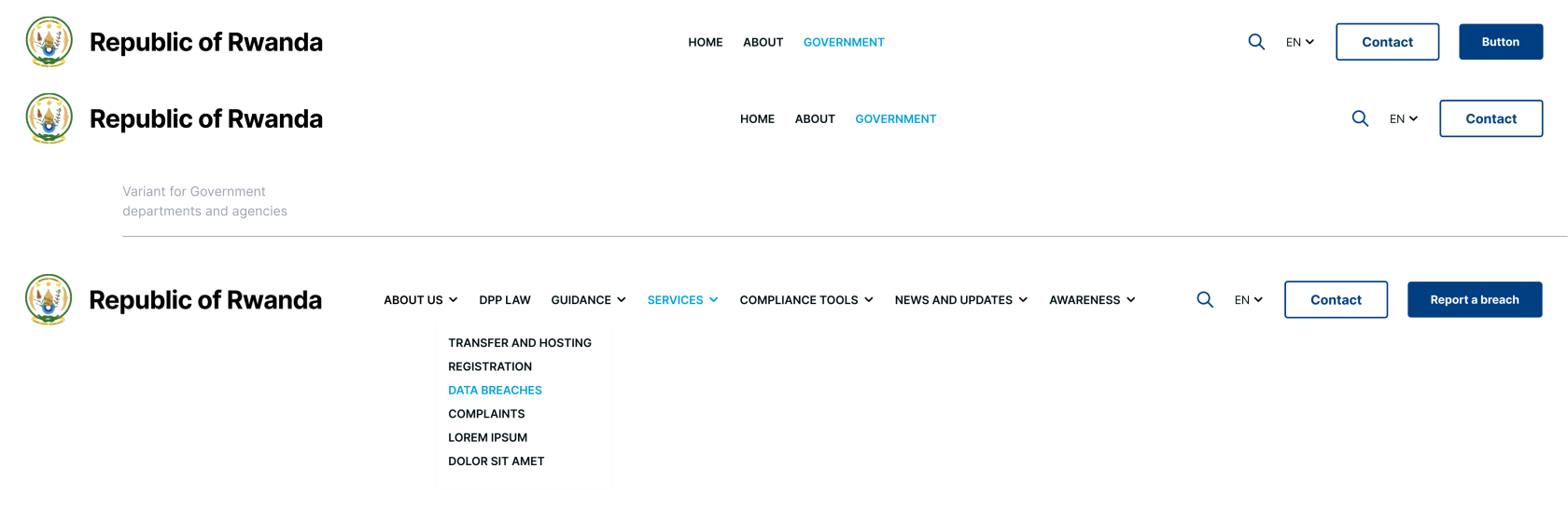](https://guidelines.risa.gov.rw/uploads/images/gallery/2025-10/3-navigation-design-1.png) - Use clear, descriptive labels for each level menu item, avoid jargon to ensure language is understandable by any user. - Limit the number of top level items to prevent visual clutter. - Use drop-down for subcategories. - On mobile devices a hamburger or toggle menu should be used. - All menu items should have hover, focus and active states. #### Secondary Navbar **Secondary navigation** Purpose: Secondary navigation should provide contextual or secondary navigation used on subpages. **Accepted Variant** Font-weight: Bold Text: Uppercase Font size: 16px Line height: 32px Letter spacing: 0 [](https://guidelines.risa.gov.rw/uploads/images/gallery/2025-10/3-navigation-design-2.png) - Secondary menu will be positioned sticky on webpage scroll and relative to website header. - To be used on subpages if necessary. - Use clear, descriptive labels for each level menu item, avoid jargon to ensure language is understandable by any user. - Limit the number of top level items to prevent visual clutter. - On mobile devices a hamburger or toggle menu should be used. - Al menu items should have hover, focus and active states. #### Side Menu **Side Navigation** Purpose: Side menu navigation should provide contextual or secondary navigation used on subpages. [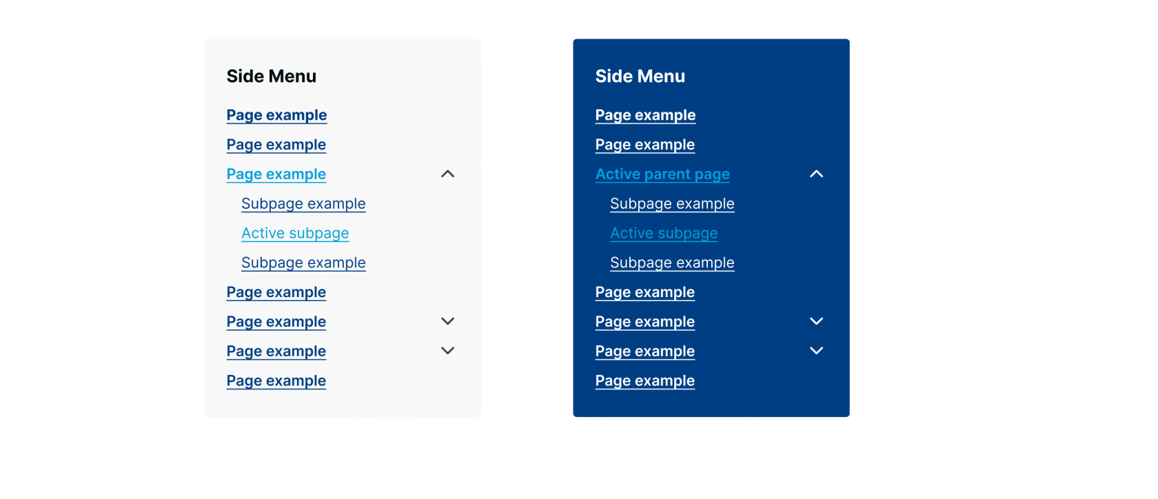](https://guidelines.risa.gov.rw/uploads/images/gallery/2025-10/3-navigation-design-3.png) #### Footer Menu **Footer Navigation** Purpose: Contains secondary links that are important for legal, informational and support purposes [](https://guidelines.risa.gov.rw/uploads/images/gallery/2025-10/3-navigation-design-4.png) #### Breadcrumbs **Breadcrumbs Navigation** Purpose: Breadcrumbs should provide a visual trail of the user’s location in the site hierarchy helping with navigation and orientation **Accepted Breadcrumbs Variants** Font size: 14px Line height: 32px Letter spacing:0 [](https://guidelines.risa.gov.rw/uploads/images/gallery/2025-10/N8b3-navigation-design-5.png) **[Navigation Design Document](https://guidelines.risa.gov.rw/attachments/84)** # Search Functionality #### Search trigger & form Rules: Use a universally recognized search icon (magnifying glass) in the header and ensure icon is easily clickable/tappable and stands out from the other header elements [](https://guidelines.risa.gov.rw/uploads/images/gallery/2025-10/4-search-functionality-1.png) - Provide an accessible label using area-label to describe the icon (e.g “Open search”) and enable keyboard focus and activation for users who navigate via keyboard. - Icon should remain visible on all devices, if space is limited on smaller screens consider alternative placement that do not compromise accessibility. - Clicking the search icon will open a full screen modal with a close button and the search input text and submit. [](https://guidelines.risa.gov.rw/uploads/images/gallery/2025-10/s7z4-search-functionality-1.png) #### Results Page Rules: Display the user’s search query so they know what was searched - Present results in a clean and organized list with clear headings with link, short description and any relevant metadata like dates or categories. - Limit the number of results and provide pagination if there are multiple results. - Clearly indicate if there are no results found, and offer alternative search option. - Maintain visual consistency with the rest of the site’s design, ensuring that typography, spacings and colors follow the proposed design. - Use proper hover and focus states for the links. **[Search Functionality Document](https://guidelines.risa.gov.rw/attachments/85)** # Layout & Structure #### Grid **Bootstrap Grid System** Purpose: Content should support responsive design and should be organized in a visually harmonious way, using Bootstrap - Use Bootstrap’s .container class for fixed-width or .container-fluid class for full-width to wrap the page content. - Use .row class to create horizontal groups of columns helping the management of gutters between columns and .col-\* classes to control the layout across different breakpoints. Use predefined column classes ensuring that columns add up to 12 per row at each breakpoint for proper alignment. - Ensure that all developers and designers adhere to these guidelines when implementing the layout using Bootstrap’s grid system. - Ensure that any custom modifications to the Bootstrap grid system are applied without altering the recommendations in this guideline. #### Header Purpose: Create a clear, engaging entry point for users that includes branding, navigation elements, language switcher and other essential tools (like search or contact button). - Position the logo in a prominent and consistent location (top-left) and ensure the header follows the visual identity with proper spacing and colors. - Integrate the main navigation and other key utilities like search icon or contact button. - The header components should adapt for smaller screens (e.g. hamburger menu for navigation). - Ensure all interactive elements remain accessible and readable on all devices and are keyboard navigable. - Header should be sticky to ensure smooth user experience and easy access to navigation while scrolling the page. #### Footer Purpose: Provide a space for secondary information, additional navigation, legal disclaimers, and contact details. - Footer should be divided into clearly defined sections (e.g., About, Legal, Contact, Social Media, Copyright, etc) having critical links (privacy policies, contact info) easily locatable. - Footer should be adapted well on small screens with collapsing sections into accordions if necessary. - Include necessary legal information (e.g. accessibility statements, privacy policies) **[Layout & Structure Document](https://guidelines.risa.gov.rw/attachments/87)** # UI Elements Uniforms important User Interface elements [](https://guidelines.risa.gov.rw/uploads/images/gallery/2025-10/PDvui-elements.png) # Content #### Voice **Copywriting Style** **Purpose**: These recommendations will ensure that the website content remains consistent, accessible, and engaging for a diverse audience **Tone and Voice** - Use plain language that is easy to understand. - Government websites should avoid jargon and overly technical language. - Find balance between a formal, reliable tone and a friendly, accessible approach. **Structure and Readability** - Use descriptive headings and subheadings to break up content and guide the reader. - Keep paragraphs brief and to the point. - Use bullet points or numbered lists where necessary. - Ensure language is inclusive and respectful of all audience segments. #### Imagery **Visual Treatment** **Purpose**: These recommendations will ensure that the website content remains consistent, accessible, and engaging for a diverse audience **Relevance and Clarity** - Choose images that clearly reflect the message of the content. Images should be relevant to the subject matter. - Use imagery that reflects the diversity of the audience. Ensure people, places, and services represented in imagery are inclusive and representative of the community. - Use high-resolution images that look professional across different devices and screen sizes and ensure they are optimized to maintain fast load times. **Accessibility** - Provide descriptive alternative text (alt text) for all images to support screen readers and improve SEO. - The alt text should describe the image’s purpose. - Use images that are either government-approved or properly licensed. #### Call-to-Action (CTA) **Design & Interaction** Purpose: These recommendations will ensure that the website content remains consistent, accessible, and engaging for a diverse audience **Clarity and Messaging** - Use direct, action-oriented language that clearly tells the user what to do (e.g., “Apply Now,” “Learn More,” “Contact Us”). - Where possible, explain the benefit of taking the action. For example, “Sign Up for Updates” can be enhanced to “Sign Up to Stay Informed.” **Design and Visibility** - Position CTAs where they are easily noticeable without overwhelming the user. Often, CTAs are best placed near related content. - Ensure that the button size and shape are consistent and align with the design system described in the guideline. **Usability** CTAs must be accessible via keyboard navigation and properly announced by screen readers. Use semantic HTML (e.g., <button> for clickable elements). #### Translation / Language Support **Purpose**: Ensure website content is accurate, accessible, and inclusive for users in multiple languages. **Content Translation** - All websites should have support the three official languages: Kinyarwanda, English, and French. - Each institution is responsible for providing and approving the content on its own website, including translations. - Automatic translation tools must not be used to ensure accuracy, clarity, and cultural relevance. - Use the content management system’s localization tools to manage multiple languages effectively. **Consistency and Accessibility** - Maintain consistent terminology and style across all languages. - Translated content should follow the same readability, tone, and inclusivity standards as the original content. - Clearly indicate language options on the website and make switching languages easy for users. **[Content Document](https://guidelines.risa.gov.rw/attachments/88)** # Responsiveness #### Desktop **Desktop Design** Purpose: These recommendations will ensure that the website maintain a consistent and optimized experience across all platforms. **Grid and Containers** - Use the same container and grid system (e.g., Bootstrap’s grid system) across all desktop pages, as defined in this guideline. - Use breakpoints for larger screens (e.g., lg, xl, xxl) so that content aligns and scales appropriately. - Prioritize hierarchies ensuring that headers, content areas, sidebars, and footers are well-defined and balanced. - Use multi-column layouts where applicable. **Navigation** - Ensure the main navigation and any secondary menus are fully visible without requiring extra interactions. - Provide clear hover, focus, and active states for interactive elements, including links, buttons, and navigation items as defined in this guideline. **Optimizations** Load high-resolution images and rich media for desktop users, while also ensuring that they are optimized for performance. #### Devices **Mobile & Tablet Design** Purpose: These recommendations will ensure that the website maintain a consistent and optimized experience across all platforms. **Responsive Breakpoints and Adaptation** - Use consistent breakpoints (e.g., xs, sm, md) as defined in the Bootstrap settings to manage layout changes across devices. - Ensure that content reflows gracefully for tablets and smartphones, with columns stacking, menus collapsing, and images resizing to fit smaller screens. **Navigation Adaptations** - Adopt a mobile-optimized navigation system (hamburger menu) to maximize screen space while maintaining easy access to essential links. - Ensure that the navigation is consistent across all devices, using the same structure and hierarchy as on desktop, but adapted for touch interactions. **Media and Performance** Use techniques such as srcset and CSS media queries to load appropriately sized images for mobile and tablet devices, improving load times and clarity. **[Responsiveness Document](https://guidelines.risa.gov.rw/attachments/89)** # Accessibility #### Standards **Accessibility Standards** These guidelines establish a high-level framework to ensure that all government websites are accessible, user friendly, and fully compliant with WCAG 2.2 standards. They should be used alongside our detailed supplementary documentation, which outlines every technical implementation and audit procedure in depth. **Guidelines** - All websites must meet or exceed the WCAG 2.2 guidelines. - Implement semantic HTML and appropriate ARIA roles to clearly define page structure and support assistive technologies. - Maintain sufficient color contrast between text and backgrounds for readability. - Provide descriptive alternative text for all non-text content such as images and icons. - Ensure that all multimedia elements include captions, transcripts, or audio descriptions. - Ensure accessibility features work seamlessly across all devices and screen sizes. - Regularly review and update accessibility implementations through scheduled audits. - Refer to the Accessibility Guideline and Accessibility Audit Process for detailed recommendations and audit procedures. #### Keyboard Navigation **Guidelines** - Ensure all interactive elements (links, buttons, forms, menus) are fully accessible via keyboard using standard navigation keys (Tab, Enter, Space, and Arrow keys). - Avoid keyboard traps by ensuring users can easily exit modals, dropdowns, or other interactive elements. - Provide clear, visible focus states (e.g., outlines or highlights) on all elements when they receive keyboard focus. - Use ARIA to announce changes to assistive technologies. - Refer to the Accessibility Guideline for detailed recommendations **[Accessibility Document](https://guidelines.risa.gov.rw/attachments/90)** # Legal and Compliance #### Privacy Policy Purpose: Clearly communicate how user data is collected, used, stored, and protected **Transparency and Compliance Requirements** - Clearly communicate how user data is collected, used, stored, and protected - Outline the types of data collected (e.g., personal information, browsing behavior) and the legal basis for processing that data. - Ensure adherence to applicable data protection regulations (such as GDPR or local privacy laws). - Explain users’ rights regarding data access, correction, and deletion, and provide contact information for data-related inquiries **Content Guidelines** - Use plain, accessible language that avoids legal jargon, making the policy understandable for all users. - Organize the policy with clear headings and subheadings (e.g., “Data Collection,” “Data Use,” “User Rights”) to help users quickly locate relevant sections. - Include information on how often the policy is updated and the effective date of the current version. - Ensure that any changes are communicated to users in a transparent manner. **Design and Integration** - Ensure that the Privacy Policy page is accessible, with proper navigation, readable text sizes, and compatibility with assistive technologies. - Provide prominent links to the Privacy Policy in the website footer and during any data collection processes (e.g., sign-up forms). - Follow the overall identity guideline for typography, layout, and color to maintain a consistent look and feel. #### Cookie Consent Purpose: Clearly inform users about the use of cookies and tracking technologies. **Types of Cookies** Distinguish between different cookie types (e.g., necessary, functional, performance, marketing) and explain the purpose of each. **Content Guidelines** - Use straightforward language to explain what cookies are used for and how they affect the user experience. - Include brief descriptions alongside options to accept, reject, or customize cookie settings. - Ensure that users can easily change their cookie preferences at any time, including a mechanism to withdraw consent. - Keep up-to-date with relevant legal requirements regarding cookie consent, and update the messaging as necessary. **Design and Integration** - Design a clear, unobtrusive consent banner or modal that appears on the first visit, adhering to the site’s visual identity guidelines. - Ensure that the design provides easy-to-identify buttons for “Accept All,” “Reject All,” or “Customize Settings.” Implement keyboard navigability and screen reader compatibility for the cookie consent interface. - Use clear focus states and ensure that the consent options are accessible on all devices. - Follow the established typography, colors, and layout rules to ensure that the cookie consent element aligns with the identity guideline. **[Legal and Compliance Document](https://guidelines.risa.gov.rw/attachments/91)** # System Feedback #### 404 **Error 404 Page** Purpose: Clearly communicate that the requested page cannot be found, and guide users back to relevant or familiar sections of the site. **Display and Visual Elements** - Clearly display the “404” error code along with a concise, friendly message (e.g., “Page Not Found”) - Consider including an illustration or icon that reinforces the error message without being overly alarming. - Maintain a balance between visual appeal and clear messaging; avoid clutter while ensuring the page is engaging - Provide direct links to the homepage, sitemap, or key sections of the site. - Include a search bar so users can quickly find the information they need. - Offer a link or contact information for support if the user needs further assistance - Make sure that all interactive elements (such as CTAs and search input fields) are accessible via keyboard navigation and are properly announced by screen readers. #### 403 **Error 403Page** Purpose: Clearly communicate that the user does not have permission to access the requested page. **Display and Visual Elements** - Clearly display the “403” error code along with a succinct message (e.g., “Access Denied” or “Forbidden”). - Provide instructions or links that help users navigate to permissible areas or contact support if necessary. - Offer a brief explanation that the user may not have the required permissions, and advise on steps they might take (e.g., signing in with proper credentials or contacting their administrator). - Keep the design clean and focused, ensuring that the message is the primary focus. - Provide direct links to the homepage, sitemap, or key sections of the site. #### Error Messages **Actions Feedback** Purpose: Provide clear, concise feedback when a user action encounters an error, so users know what went wrong and how to resolve it. **Consistency and Clarity** Provide clear, concise feedback when a user action encounters an error, so users know what went wrong and how to resolve it. Ensure that error messages across the website are uniform in style, tone, and behavior, using the corresponding colors described in this guideline for all error messages. **Content Guidelines** - Use simple, non-technical language that explains the error in plain terms - Include actionable guidance (e.g., “Please check your input and try again” or “Contact support for help”) **Tone and Voice** - Maintain a friendly and supportive tone to prevent user frustration - Avoid blame or overly technical language; the focus should be on solving the issue. **Placement Place** - Place error messages near the relevant element (for example, directly below an input field) so users can quickly understand the context of the error. - Ensure error messages are clear and accessible on all devices. They should scale and reposition appropriately on mobile, tablet, and desktop views. **Screen Reader Support** Use ARIA roles (such as aria-live="assertive" ) to announce error messages to users relying on assistive technologies. **[System Feedback Document](https://guidelines.risa.gov.rw/attachments/92)** # Security Features #### Security **TYPO3’s Built-In Security** Purpose: Ensure robust protection of user data and safeguard government websites against security threats **Secure Authentication & Role-Based Access Control** TYPO3 provides secure login mechanisms, support for multi-factor authentication (with proper configuration), and fine-grained permission settings for backend users. **Input Validation and Sanitization** TYPO3 has built-in routines to sanitize and validate user input, reducing the risk of SQL injection, XSS, and other common vulnerabilities. **Session Management** Secure session handling is integrated into TYPO3, with options to configure secure cookies (using Secure and HttpOnly flags) and session timeouts. **Data Protection & Encryption** The system supports HTTPS enforcement and must be configured to encrypt sensitive data, aligning with best practices for data security. **Logging and Monitoring** TYPO3 includes logging capabilities that capture security-related events, aiding in monitoring and incident investigation. **SSL Certificate** - Obtain SSL certificates from reputable and trusted Certificate Authorities (CAs) to ensure credibility and widespread browser compatibility. - Monitor the expiration dates of SSL certificates and set up automated reminders or renewals to prevent service disruptions. - Ensure that TYPO3 installations enforce HTTPS across all pages. **Additional Considerations** - Ensure proper configuration verifying that TYPO3’s security settings are correctly configured to meet your specific government website requirements. - Consider adding custom measures such as regular security audits and penetration testing. - Keep up with TYPO3 security advisories, updates and best practices #### Security for Other Applications (Web-based and Mobile) While TYPO3 provides a strong security foundation, additional web-based and mobile applications require dedicated security measures. The following guidelines ensure consistent, high-level security practices across all platforms. **Secure Coding Practices** - Implement secure coding standards to prevent vulnerabilities. - Perform static code analysis and regular code reviews to identify and resolve security issues. **API Security** - Protect API endpoints with robust authentication, encryption, and rate limiting. - Use token-based authentication (e.g., OAuth) and ensure sensitive data is never exposed. **Third-Party Integrations** Keep all third-party components updated and monitor for any security advisories. **Access Control & Identity Management** Implement role-based access control (RBAC) to limit user permissions and minimize risk. **Data Protection & Encryption** - Ensure all data transmitted between applications, whether web-based or mobile, is encrypted using TLS/SSL. - Apply encryption to sensitive data stored in databases or transmitted through APIs. **Regular Security Audits** - Conduct regular vulnerability assessments and penetration testing across all platforms. - Maintain an incident response plan that covers both web and mobile environments. **Monitoring & Incident Response** - Set up centralized logging and monitoring tools to detect and respond to potential security breaches. - Integrate with a SIEM (Security Information and Event Management) system to analyze security events in real time. **[Security Features Document](https://guidelines.risa.gov.rw/attachments/93)** # SEO and Metadata Standards Purpose: This section leverages TYPO3’s built-in capabilities while incorporating additional enhancements like schema markup, keyword optimization, and proper sitemap and robots.txt configuration **Metadata and On-Page SEO** - Ensure every page includes a unique, descriptive title tag that accurately reflects the content. - Keep title tags concise (typically 50–60 characters) and include primary keywords where relevant. - Use engaging and informative meta descriptions on each page to summarize the content. - Meta descriptions should be clear, include relevant keywords, and be within the recommended length (around 150–160 characters). - Integrate relevant keywords naturally within your content, title tags, and meta descriptions. - Implement canonical tags to prevent duplicate content issues and guide search engines to the preferred version of a page. **TYPO3 Built-In SEO Features** - Utilize TYPO3’s built-in fields for meta titles, meta descriptions, and keywords. Ensure these are populated for every page. - Leverage TYPO3’s functionality to generate canonical URLs automatically. - Use TYPO3’s URL rewriting and routing configurations to create clean, SEO-friendly URLs that are both descriptive and consistent. - Use Open Graph and Twitter Card meta tags for improved social sharing and engagement. **Sitemap and Robots.txt** - Generate and maintain an XML sitemap for each website to help search engines index content efficiently. - Use TYPO3’s built-in sitemap generation feature to ensure the sitemap is always up-to-date. - Create a properly configured robots.txt file to guide search engine crawlers. - Define which parts of the website should be crawled and which should be excluded (e.g., backend pages or duplicate content). **[SEO and Metadata Standards Document](https://guidelines.risa.gov.rw/attachments/94)** # Analytics Tracking Purpose: To gain comprehensive insights into website performance and user behavior, this section outlines the implementation of a centralized analytics platform. The goal is to standardize tracking and reporting across all websites, enabling informed decision-making and continuous improvement of digital services. #### **Centralized Analytics Implementation** **Centralized Google Analytics Account** - **Parent Account Setup** - Create a single, centralized Google Analytics account that serves as the parent account for all government websites. - Each website should be configured as a separate property or view within this parent account. - **Unified Tracking** - Use standardized tracking codes across all websites to ensure consistency. - Ensure that custom dimensions and events are aligned with the overall analytics strategy. - **Cross-Domain Tracking (if applicable)** - Implement cross-domain tracking for scenarios where users navigate between different government websites, ensuring user sessions and data continuity. **Data Collection and Integration** - Integrate Google Analytics with other data sources or platforms where necessary (e.g., Google Tag Manager) to facilitate enhanced tracking. - Set up automated data import/export routines to centralize data analysis and reporting. #### **Key Metrics and Reporting** **Visitor Statistics** Reports should include core visitor metrics such as: - **Total Visits:** Overall number of sessions across all websites. - **Unique Visitors:** Count of individual users visiting the sites. - **Page Views:** Total number of pages viewed. - **Session Duration:** Average time users spend on the site. - **Bounce Rate:** Percentage of visitors who leave after viewing only one page. **Demographics** Capture and report demographic information to understand the audience better: - **Age and Gender:** Breakdown of users by age groups and gender. - **Location:** Geographic distribution of visitors (country, region, city). - **Language Preferences:** Primary language settings of the users’ browsers. **Device and Browser Usage** Monitor how users access the websites: - **Device Type:** Comparison of mobile, tablet, and desktop usage. - **Browser Data:** Information on the browsers used, helping identify any compatibility issues. - **Operating Systems:** Analysis of operating system usage to tailor performance optimizations. #### Implementation Best Practices **Consistent Tagging and Configuration** - Ensure that all websites follow the same tagging structure and measurement protocol. - Use a centralized dashboard for regular monitoring and comparative analysis. **Custom Reports and Dashboards** - Develop custom reports that compile key metrics from all websites, offering a comprehensive view of performance. - Set up dashboards in Google Analytics platform that highlight real-time data and trends. **Data Privacy and Compliance** Ensure that all data collection adheres to legal and privacy guidelines. **Regular Audits and Updates** - Schedule periodic audits to ensure that tracking codes, filters, and goals are working correctly. - Update the analytics configuration as necessary to incorporate new metrics or business requirements. **Cross-Department Collaboration** Involve relevant stakeholders (IT, communications, data analysts) in setting up and reviewing the analytics implementation. **Continuous Improvement** - Use insights from the analytics reports to guide design improvements, content adjustments, and overall digital strategy enhancements. - Regularly review analytics performance against benchmarks and adjust strategies accordingly. **[Analytics Tracking Document](https://guidelines.risa.gov.rw/attachments/95)** # TYPO3 Structure Purpose: To maintain a coherent and unified user experience across all sites, it’s essential that both page templates and content elements are standardized. TYPO3 offers a range of built-in, ready-to-use elements that can be implemented consistently. #### Template Consistency **Uniform Design** Templates for similar types of pages (e.g., homepage, landing pages, information pages, event listings) should follow the same design and structural guidelines to ensure a consistent user experience. **Centralized Management** Utilize TYPO3’s template management to create, update, and distribute templates across all sites, ensuring that any design or layout updates are reflected uniformly. **Customization Within Limits** While slight modifications may be necessary for site-specific content, the overall structure, header, footer, and navigation areas should remain consistent. **Documentation and Guidelines** - Follow this guideline’s recommendations for each layout structures, grid systems, and placement of key elements. - Define naming conventions and versioning for templates to streamline maintenance and future updates. #### Content Elements Consistency **Ready-to-Use TYPO3 Elements** TYPO3 includes a diverse range of built-in content elements that should be used consistently. **Text Elements** - Standard Text A paragraph should follow the font family, size, and line height defined in the typography section of this guideline. - Rich Text Editor (RTE) for formatted content The RTE content should automatically inherit styles for H2, H3, and body text as defined in the typography section. **Media Elements** - Text & Image - Pair descriptive text with an illustrative image. - The text is aligned alongside the image, with consistent margins and spacing that match the design’s grid system. - Image Gallery/Slider - All images in the slider should have the same dimensions, consistent border styles or gradient overlay if applied, as well as navigation controls and bullets. - Video Embed - The video container should maintain a consistent aspect ratio, and a fallback image or caption should be provided as per accessibility standards. **Header Elements** - Page Titles and Section Headers - These headers should use consistent typography, font size, color, and spacing to reinforce the site’s identity. **Lists and Tables** - Bullet List - The bullet style, indentation, and spacing are uniform across all pages. - Numbered List - The numbering format and list styling are consistent across all pages. - Data Table - Data tables should have consistent borders, header styling, and cell padding to ensure readability and visual uniformity. **Custom Elements** HTML elements may be used for specialized content if needed, following accessibility and design standards. #### Usage Guidelines **Consistency in Application** Use the same content element types for similar data presentations across all sites. For example, use the “Text & Image” element consistently for sections that combine visuals with text. **Visual and Functional Uniformity** Ensure that the styling, spacing, and behavior of these elements are aligned with the identity guideline. This includes using the same CSS classes, grid configurations, and responsive behaviors. **Maintenance** Standardized templates and content elements make it easier to update and manage sites over time, as changes to a core element or template will automatically propagate across the network. **[TYPO3 Structure Document](https://guidelines.risa.gov.rw/attachments/96)** # Centralized Government Portal #### Hosting Government institutions must utilize hosting services that meet the highest standards of security, reliability, and regulatory compliance, in full adherence to the Law on Data Protection and Privacy in Rwanda. To promote compliance, standardization, and cost efficiency across all government digital platforms, institutions are strongly encouraged to host their websites under the **Centralized Government Portal** managed by the Rwanda Information Society Authority (RISA). **Key Advantages** - **Enhanced Security:** Centralized monitoring and enforcement of cybersecurity best practices across all government websites. - **Improved Reliability:** Guaranteed uptime and optimal performance through a professionally managed infrastructure. - **Simplified Maintenance:** Streamlined updates, troubleshooting, and technical support within a unified hosting environment. - **Regulatory Compliance:** Full alignment with national data protection and privacy standards as required by law. - **Cost Efficiency:** Unified hosting eliminates the need for individual hosting expenditures. - **Harmonized Design and Experience:** Ensures a consistent look and feel across all government institutions, reinforcing the national digital identity and improving user trust. #### How to Join To join the Centralized Government Portal, institutions must submit a formal written request addressed to the Chief Executive Officer (CEO) of the Rwanda Information Society Authority (RISA). A copy of the request should be sent to**Support:** The RISA Software Team will assist institutions in aligning their websites with the Government of Rwanda Websites Guideline.